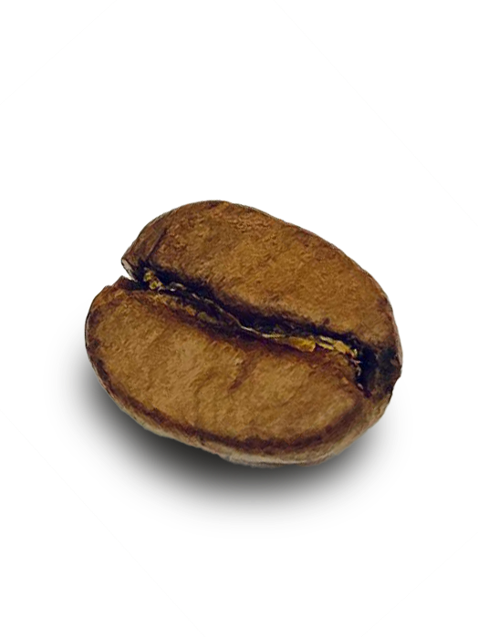
the
coffee
extrac
tion
philos
ophy.
the what
Just like coffee starts with a single bean—its origin, varietal, and potential—design starts with strategy. I'm a multidisciplinary designer working across brand, digital, and motion. Every project begins by understanding the core: what are we making, and what's its inherent potential?
the why
In coffee, extraction is everything. Under-extract and you get sourness—incomplete, unrealized potential. Over-extract and you get bitterness—forced, overdone. The perfect cup comes from knowing exactly how much to draw out and when to stop. Design works the same way. I focus on extracting exactly what's needed: clarity, intent, and purpose. Not underdeveloped. Not overwrought. Just right.
the how
From bean to cup, every step matters: sourcing, roasting, grinding, brewing. I work across Figma, Adobe Creative Suite, and motion tools to move from concept to execution—crafting identities that scale, interfaces that guide, and motion that engages. The final experience is the sum of intentional decisions at every phase. Every detail in service of the whole.
Hi, I’m Ryndrick J. Gaines
UX Designer | Visual Design | User Research | Interactive Prototyping | Building intuitive experiences that solve real user problems

Creative UX and Visual Design professional with a background spanning brand development, motion design, and user-centered digital product design. Experienced in translating complex concepts into intuitive visual interfaces, conducting user research, and building interactive prototypes. Strong foundation in visual design, information architecture, and cross-functional collaboration across energy, healthcare, media, and education sectors. Demonstrated ability to solve user problems through thoughtful design systems, streamlined user flows, and conversion-focused experiences.
Hertz Car Sales Preview Card Redesign
Role: UX/UI Designer (Self-Directed Practice Project)
The Challenge
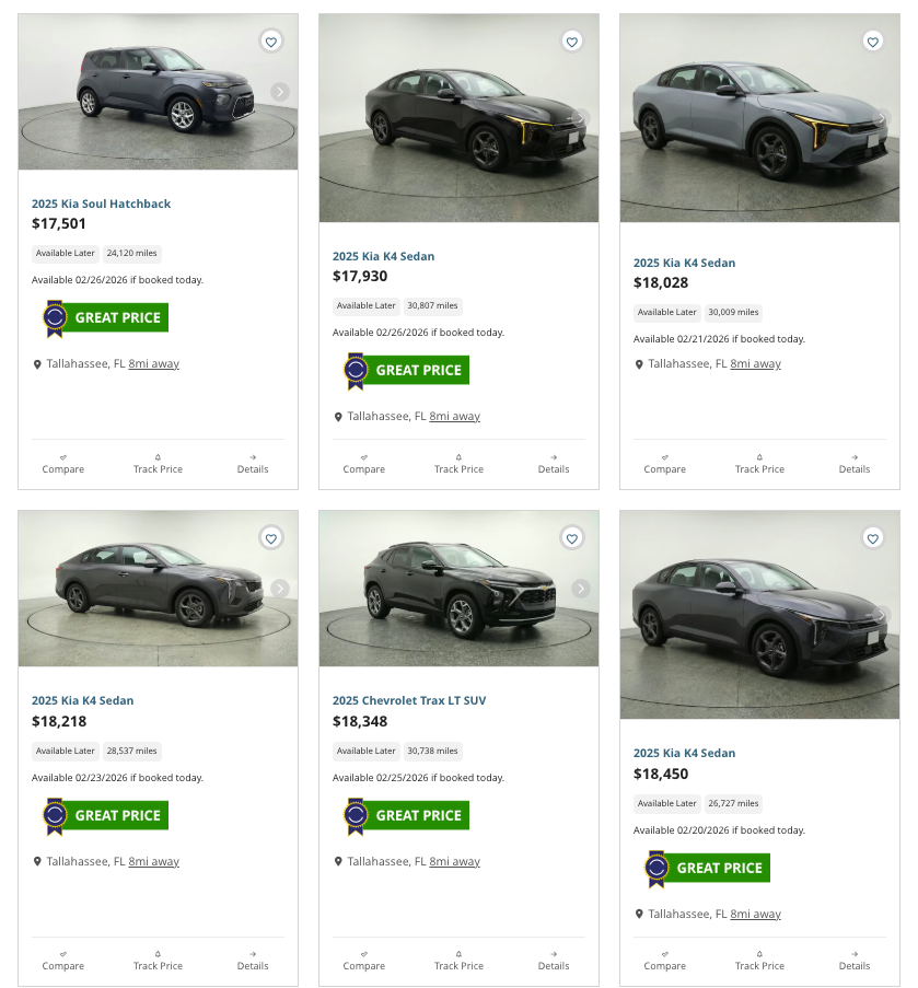
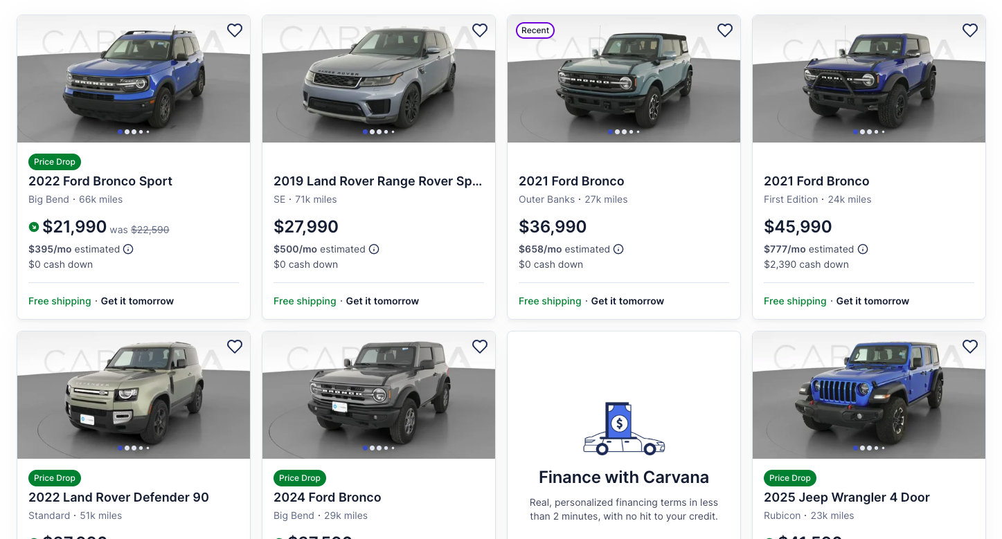
Hertz Car Sales' vehicle preview cards presented multiple usability challenges affecting user engagement. Photo navigation was barely visible despite 12 images being available per vehicle. Three competing CTAs created decision paralysis. Availability messaging lacked clarity. Information hierarchy was weak. And inconsistent vehicle framing created a visually disjointed, staggered appearance across the grid.
The Process
Conducted competitive analysis against Carvana, a leader in online automotive sales, to identify best practices in automotive e-commerce. Analyzed user flow, information architecture, and interaction patterns to determine optimal card structure.
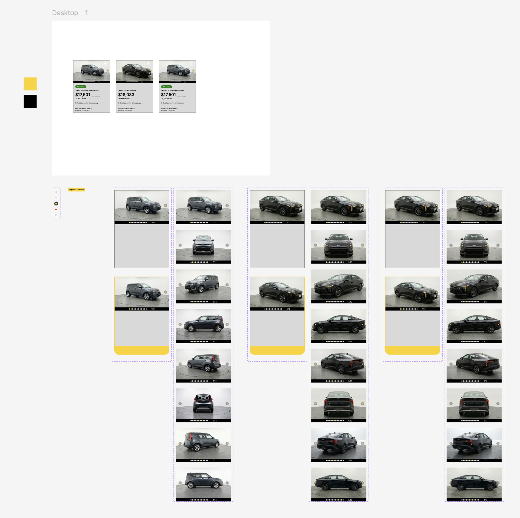
Component and Card building:
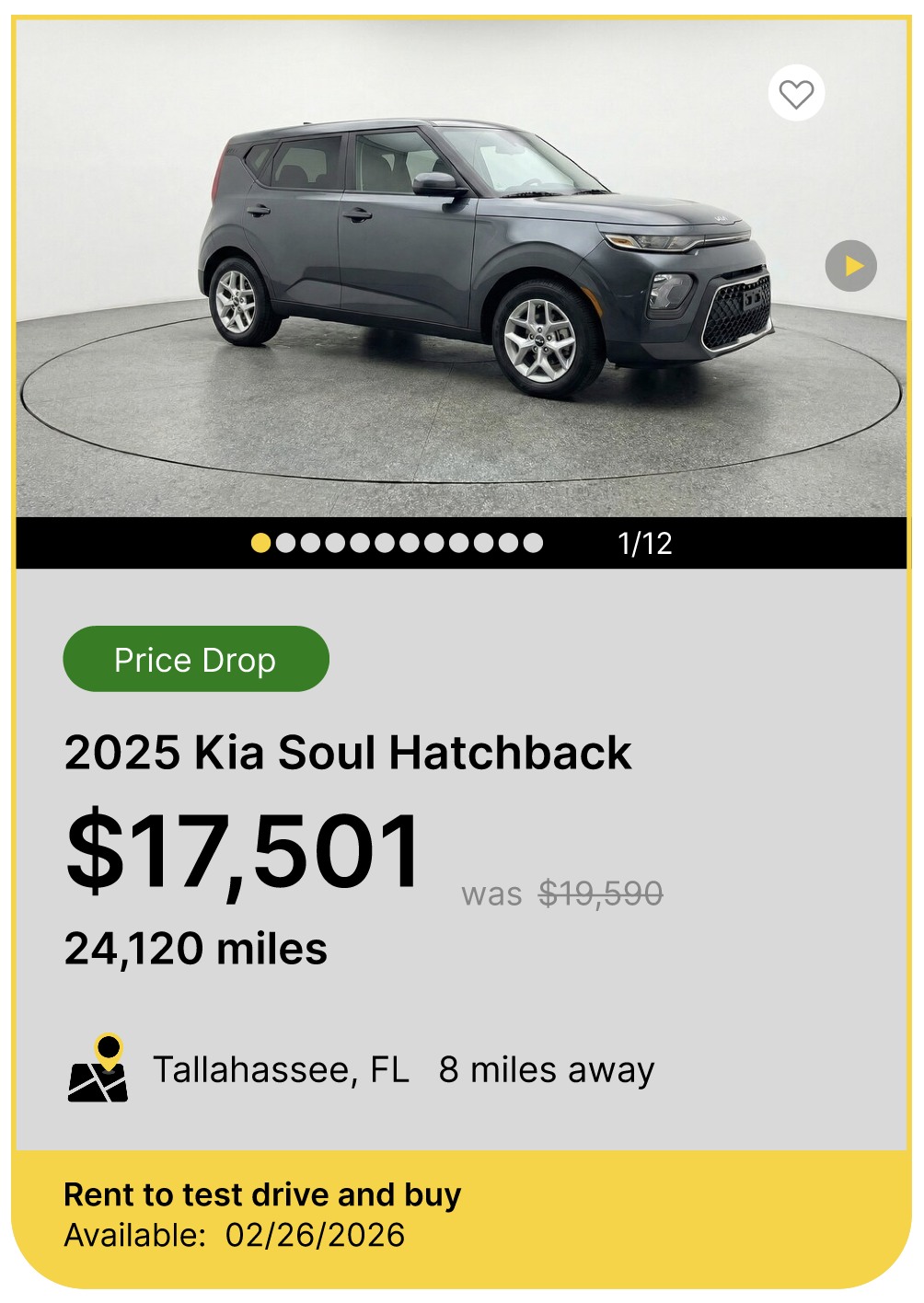
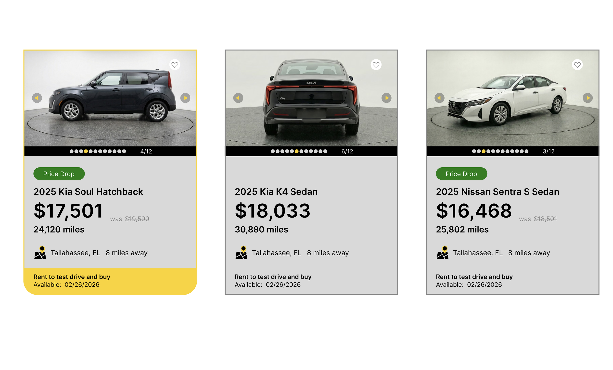
Redesigned Hover State
Features yellow highlight that gives a nod back to the HERTZ brand and curved base that highlights the Rent to test drive and Availability messaging
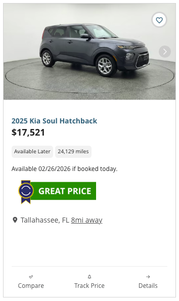
Before Static State
Unclear visual hierarchy of information and competing CTAs
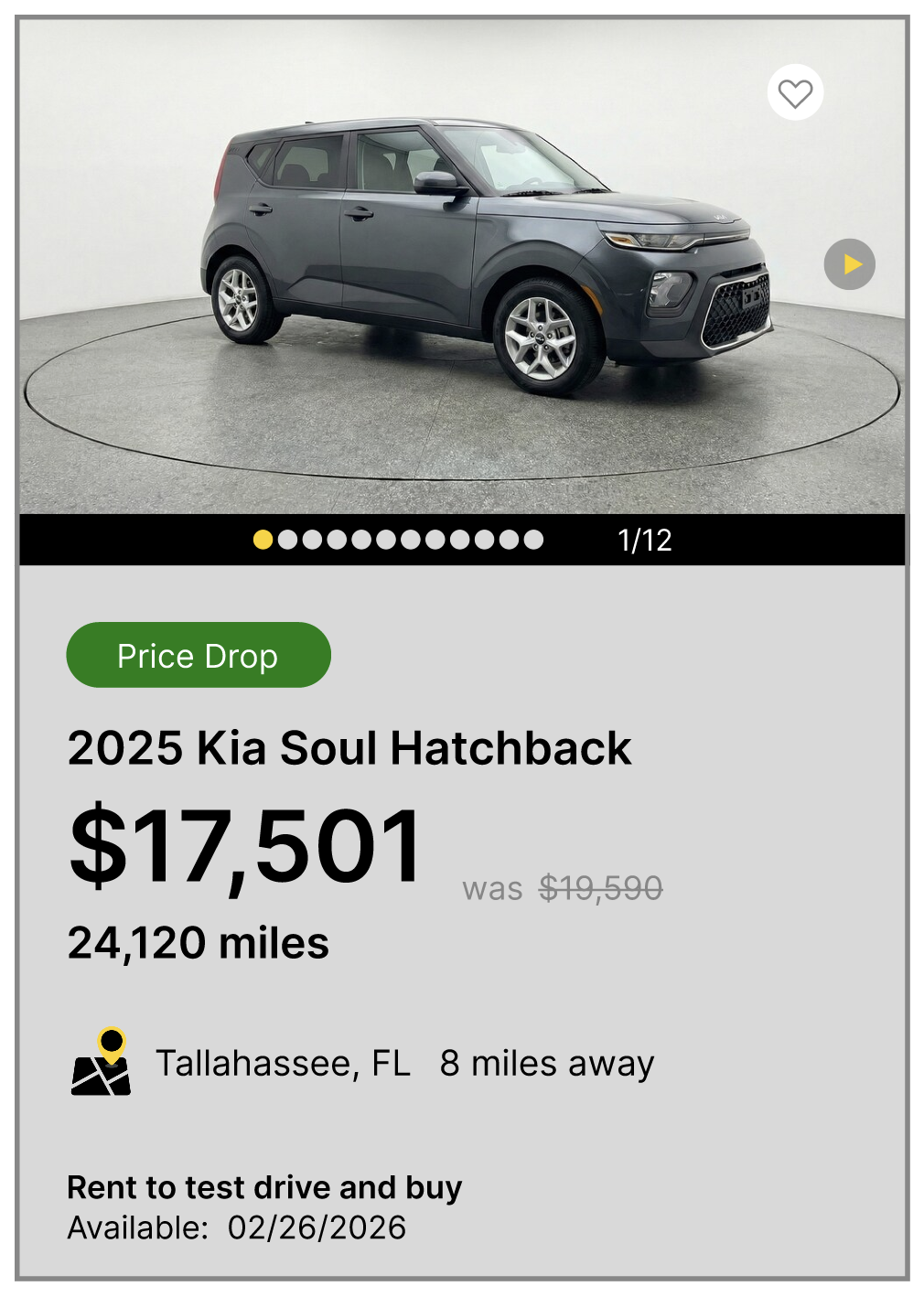
Redesigned Static State
Clear visual hierarchy of needed information
Before Hover State
Has no hover state or clear CTA or interaction that indicates the card is clickable
The Solution
Full-Card Interaction: Instead of using a dedicated CTA button, implemented a hover state interaction making the entire card clickable (following Carvana's pattern). On hover, the card elevates with subtle shadow, a cleaner approach that eliminates the three competing buttons (Compare, Track Price, Details) and creates a single, obvious interaction
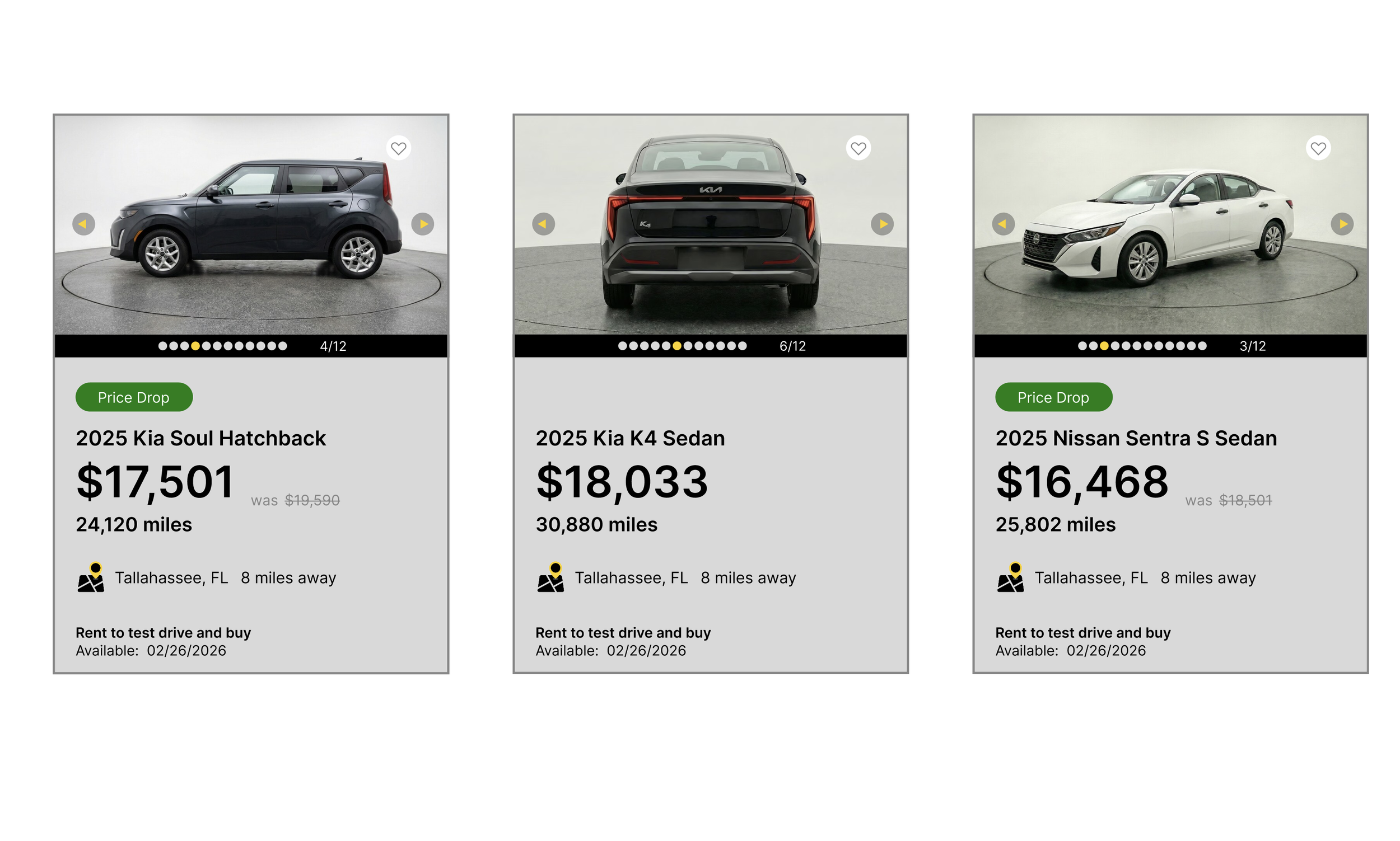
Enhanced Photo Navigation: Implemented visible dot indicators with numeric counter (3/12) and high-contrast navigation arrows, improving on Carvana's dots-only approach. Users can click arrows to browse sequentially or tap dots to jump to specific photos, making the 12-photo gallery immediately discoverable and explorable
Interactive Photo Elements: Arrow buttons feature hover states (opacity and scale changes) with disabled states on first/last photos. Navigation clicks are isolated from the card click, allowing photo browsing without triggering navigation to the detail page
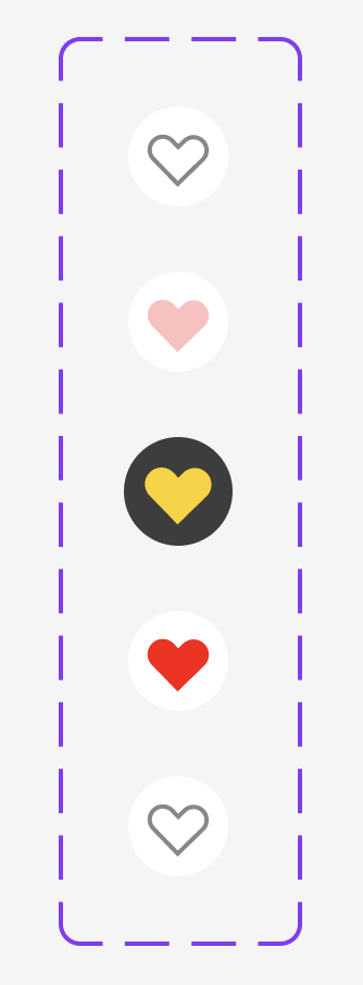
Quick Actions: Heart icon in top-right allows favoriting without leaving the page, with visual feedback (filled heart) when saved
Improved Information Hierarchy: Restructured content flow prioritizing price (matching Carvana's emphasis), followed by availability and key specs in natural scanning order
Clarified Messaging: Set a simple CTA and consolidated the messaging to say “Rent to test drive and buy” followed by “Available: 02/26/2026”
Added Context: Included trim levels (following Carvana's model), improved mileage hierarchy, and consolidated location/distance into single scannable line

Competitive Advantage
While matching Carvana's clarity and transparency, the redesign leverages Hertz's superior photo count (12+ vs Carvana's typical 5-8) with enhanced navigation, creating a best-in-class browsing experience.
Key Takeaway
Effective UX prioritizes clarity over cleverness, answering users' fundamental questions (What is it? How much? When can I get it?) quickly and transparently through intuitive interactions.
Browning Medical & Wellness Website
Designed and developed a mobile-first website for Browning Medical and Wellness, a primary care practice expanding across four North Florida counties. Collaborated directly with the physician and head RN to establish a patient-centered content hierarchy that puts portal access and services front and center. Built on Squarespace with custom motion design and brand assets, the site reduces friction between patient intent and action — making it easy to book, explore services, and trust the practice before ever walking through the door.
Role: UX Designer & Developer (Freelance Project)
Visit their website here:
www.browningmedandwell.com
Problem & Goals
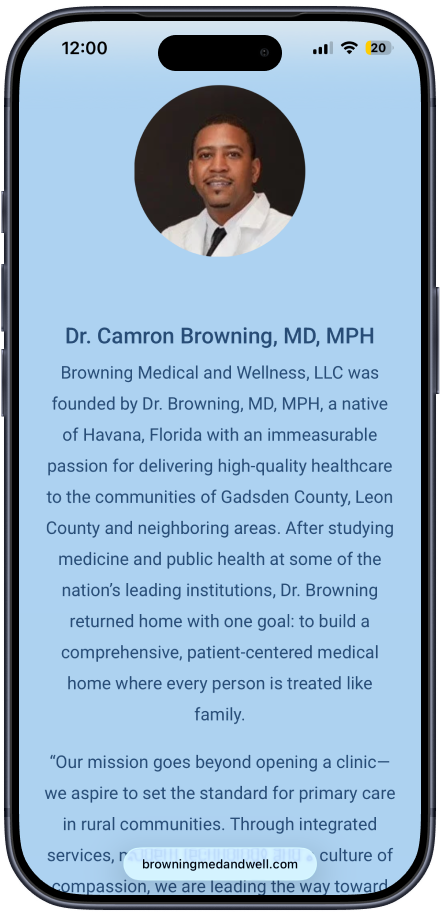
Browning Medical and Wellness is a primary care practice founded by Dr. Camron Browning, MD, MPH — a native of Havana, Florida — with a mission to bring accessible, compassionate healthcare to underserved communities across Leon, Gadsden, Wakulla, and Jefferson Counties in North Florida.
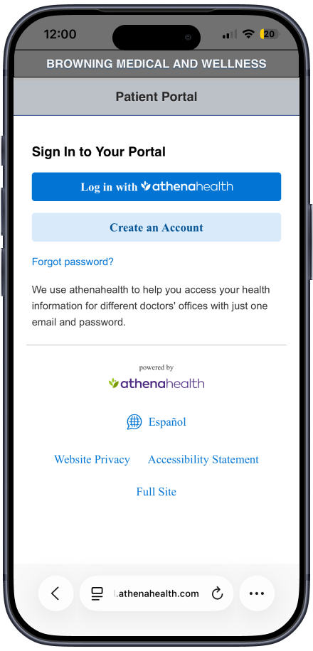
As the practice prepared to expand across four locations, it needed a website that could serve a growing and diverse patient base, many of whom may be navigating a healthcare website for the first time. The central challenge was clear: get patients to the portal fast. The patient portal — powered by athenahealth — is where patients book appointments, view results, request refills, and message their care team. Every design decision had to reduce the distance between landing on the site and reaching that portal.
Secondary goals included clearly presenting Browning's comprehensive service offerings, introducing the care team, listing accepted insurance providers, and conveying the brand's values — without any of that getting between a patient and their immediate need.
01
Research & Discovery
Formal user research was not part of this engagement. Instead, discovery was led through direct stakeholder collaboration with Dr. Browning and the head RN. These conversations were the foundation of every content and hierarchy decision.
The key question driving the discovery process was: what does a patient need to see first, and what can wait?
From those conversations, a clear content priority emerged:
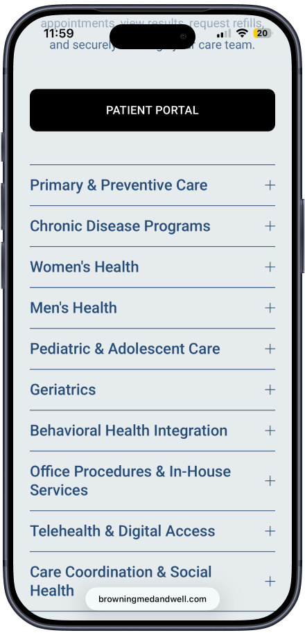
Tier 1 — Immediate need: Patient portal access, services overview, and how to reach the practice
Tier 2 — Trust building: Insurance providers, care team bios, and office hours
Tier 3 — Brand depth: Mission statement, brand story, educational resources, and careers
To establish a regional baseline, I also reviewed leading medical providers across the four target counties. This informed how to differentiate the Browning Medical and Wellness experience through clarity, warmth, and ease of access These qualities are not always present in the local competitive landscape.
02

Design Process
Sketching the Flow The process began with hand-sketched wireframes to map the patient journey from first landing to patient portal. Sketching before jumping into the platform allowed for quick iteration on structure and content hierarchy without the distraction of visual design.
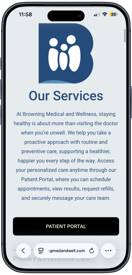
Information Architecture The homepage was structured to answer the patient's most urgent question — where do I go to book? — before anything else. The Patient Portal CTA appears in the navigation and again immediately after the services overview, ensuring it's accessible at multiple points in the scroll without requiring the patient to read through the full page.
The page flow on the live site reflects this directly:
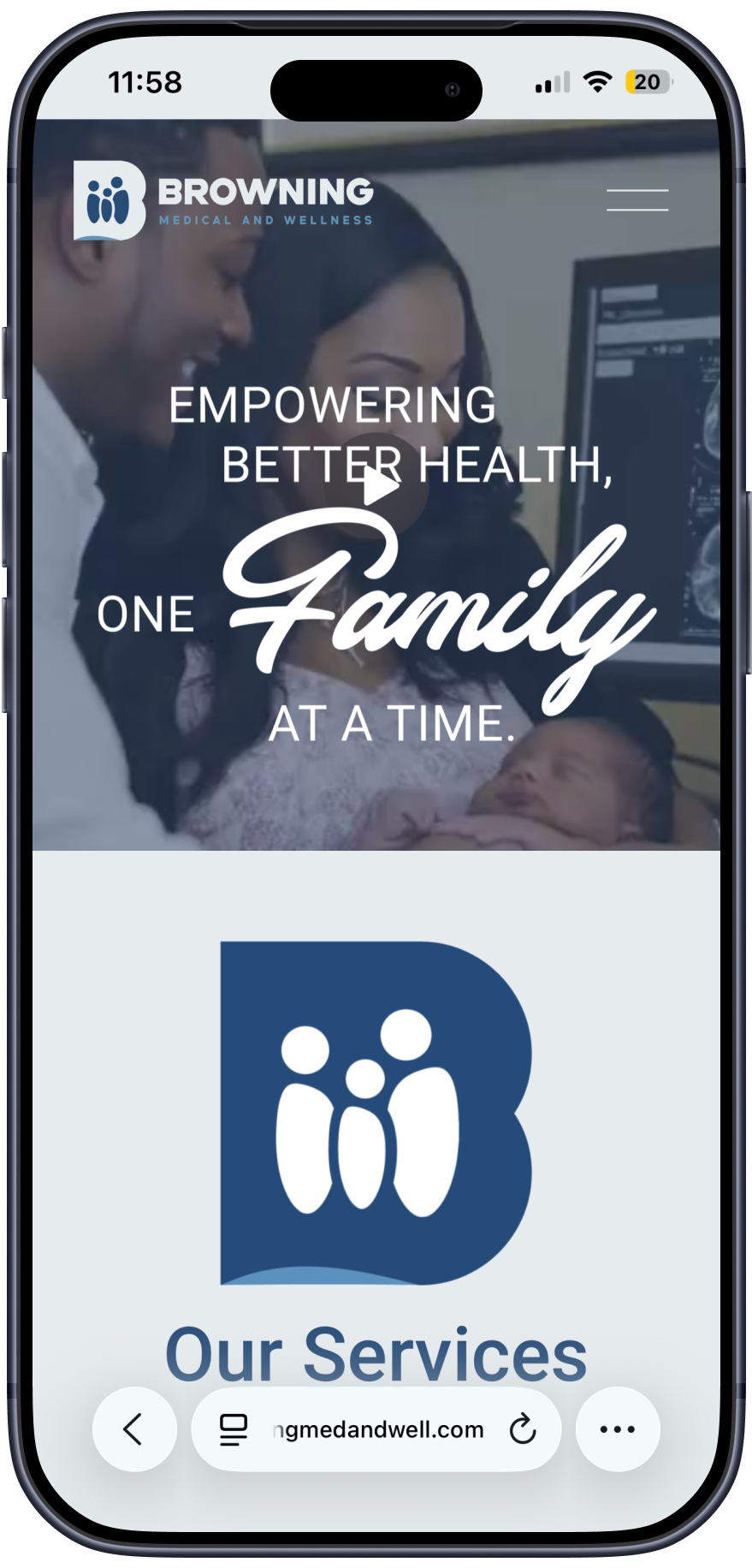
Navigation with persistent Patient Portal link
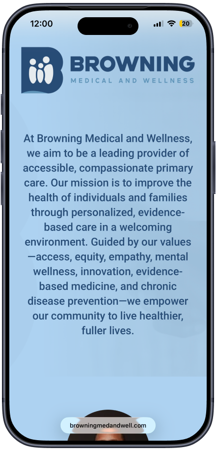
Mission statement / brand visual hook
Animated brand mark (motion design)
Full services overview with Patient Portal CTA embedded
Mission and values statement
Brand story and care team introductions
Educational resources
Accepted insurance providers
Careers section
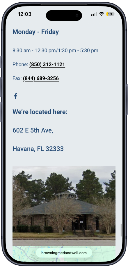
Hours, location, and contact
Visual & Motion Design Brand assets were created in Adobe Illustrator and Adobe Photoshop to establish a cohesive, trustworthy visual identity. A custom animated brand mark was built in Adobe After Effects and exported via Adobe Media Encoder, adding visual engagement on load without sacrificing performance. The motion design serves a functional purpose — it draws the eye and signals professionalism before the patient reads a single word.
Platform & Build The site was built entirely in Squarespace, which balanced design flexibility with a manageable content management system the Browning team can maintain independently as the practice scales.
Mobile-First Every layout, font size, and interactive element was designed for mobile first. Patients in rural counties are more likely to arrive via a mobile device, and the portal CTA needed to be just as prominent and tappable on a phone as it is on a desktop.
03
Final Solution & Results
The final website delivers a patient-centered experience that balances immediate utility with brand credibility across an expanding multi-county practice.
What was delivered:
A mobile-first, fully responsive Squarespace website serving patients across four North Florida counties
A persistent, top-of-navigation Patient Portal link (athenahealth) ensuring zero-friction access at every scroll depth
A homepage content hierarchy built around patient intent — services and portal access lead, brand story follows
A comprehensive services section covering 10 care categories, from primary and preventive care to telehealth, behavioral health integration, and community outreach
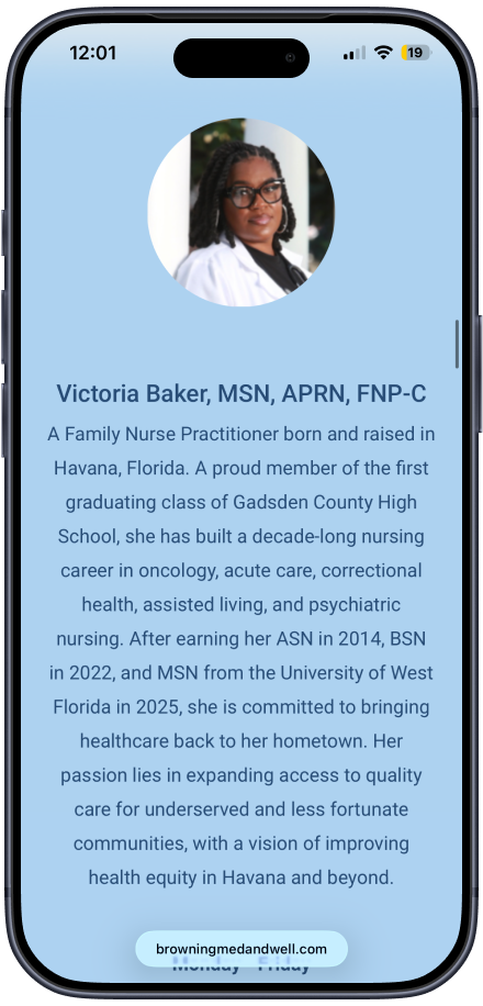
Care team profiles for Dr. Camron Browning and Victoria Baker, MSN, APRN, FNP-C, building patient trust before the first visit
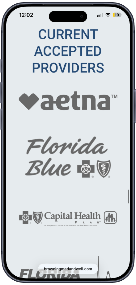
Accepted insurance provider display including Aetna, Florida Blue, Capital Health Plan, Florida Medicaid, TRICARE, Cigna, and Medicare — plus a callout for sliding scale and self-pay options reflecting the practice's commitment to equity
Custom motion design and brand assets reinforcing the practice's identity and professionalism from the first scroll
A scalable Squarespace build the Browning Medical and Wellness team can maintain and grow as new locations come online
03
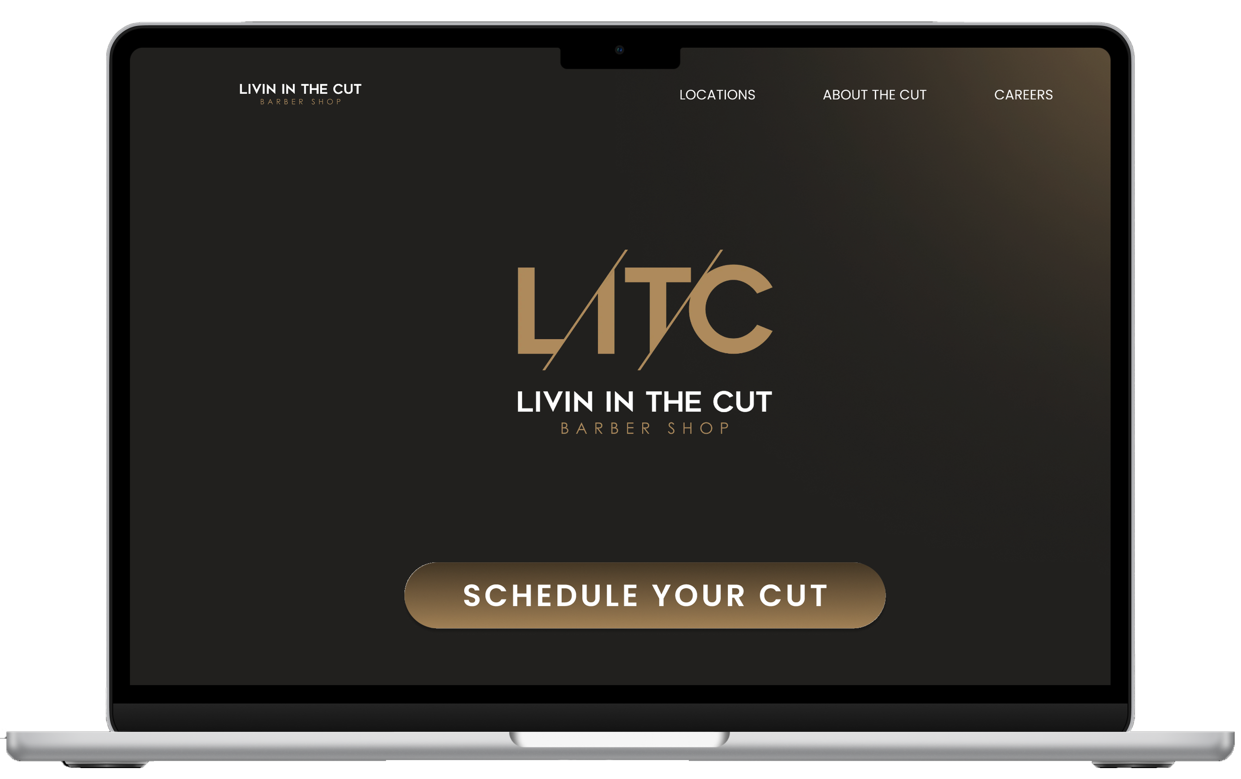
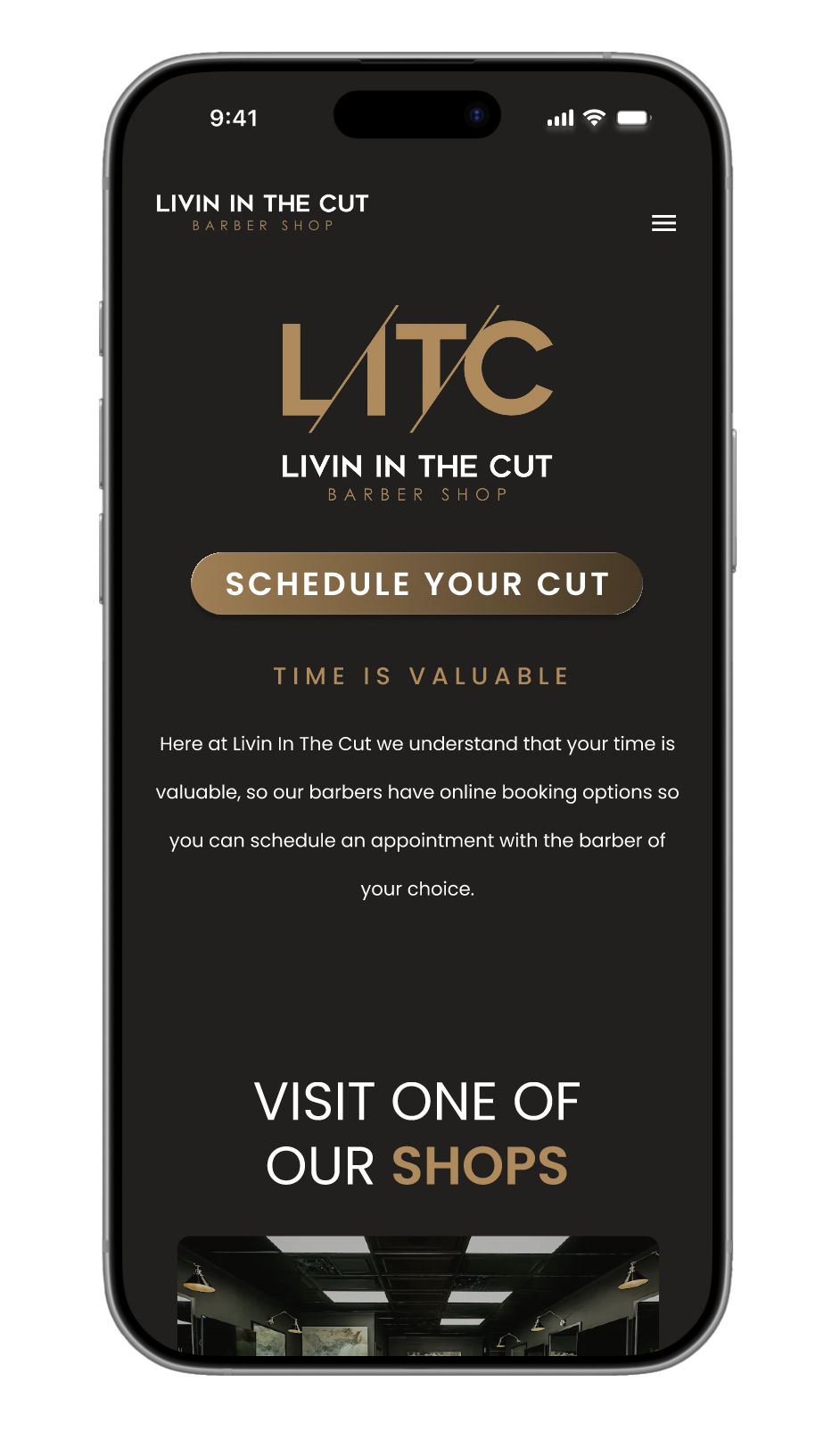
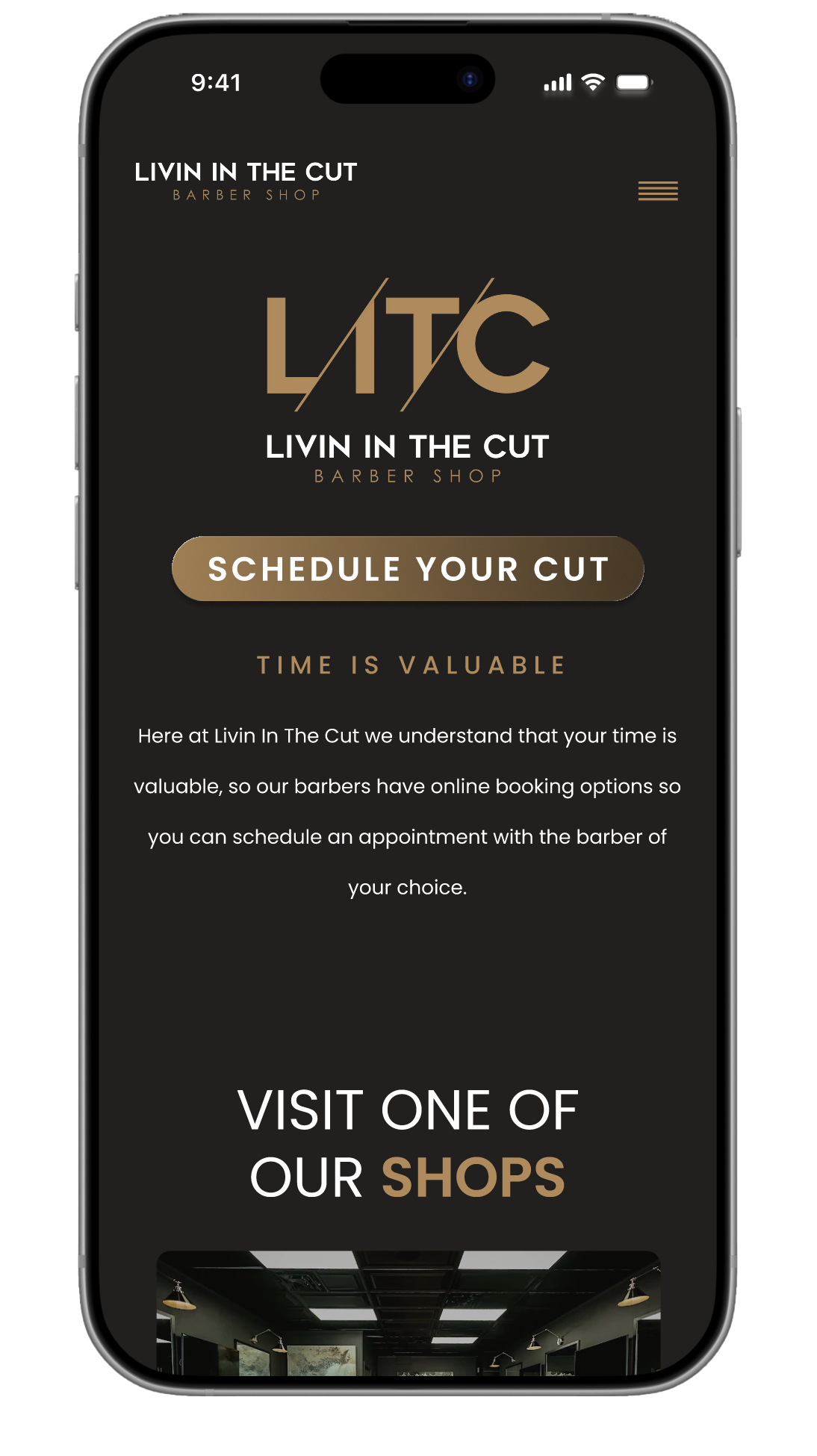
Livin in the Cut Barbershop Website
Redesigned the Livin In The Cut barbershop website to prioritize user needs over brand messaging. Created a high-fidelity interactive prototype that solves the core navigation problem of presenting two locations clearly, streamlines the booking process, and consolidates content into a more intuitive information architecture. The redesign puts essential actions front and center while maintaining the shop's local, community-focused identity.
Defining the Opportunity
Livin In The Cut has built a strong reputation in Tallahassee since 2009, but their website doesn't serve their customers effectively. The current design buries essential booking actions, creates confusion around their two-location structure, and fragments information across multiple pages.
For local service businesses, a website's primary job is to convert interest into appointments. When the path to booking is unclear or cluttered, potential customers abandon the site. The opportunity: redesign the experience to prioritize user goals - making it easy to find a location, understand services, and book an appointment - while showcasing the quality and personality that has kept customers coming back for over a decade.
01
I conducted a comprehensive audit of the existing Livin In The Cut website to identify usability issues and missed opportunities. The audit revealed several critical problems:
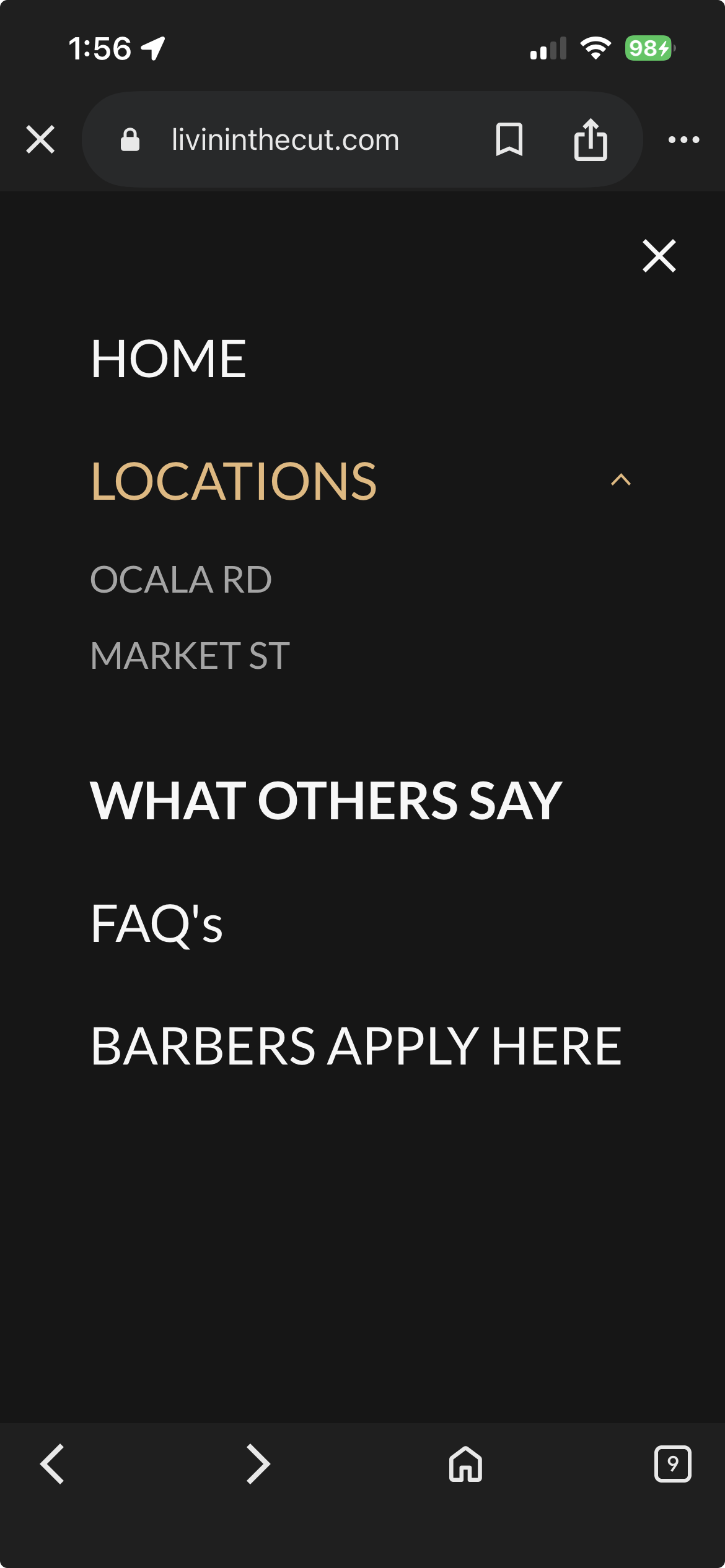
Information Architecture - Content was fragmented across six main pages, forcing users to navigate multiple clicks to gather basic information. Testimonials, FAQs, and service details existed as separate destinations rather than supporting the primary booking flow.
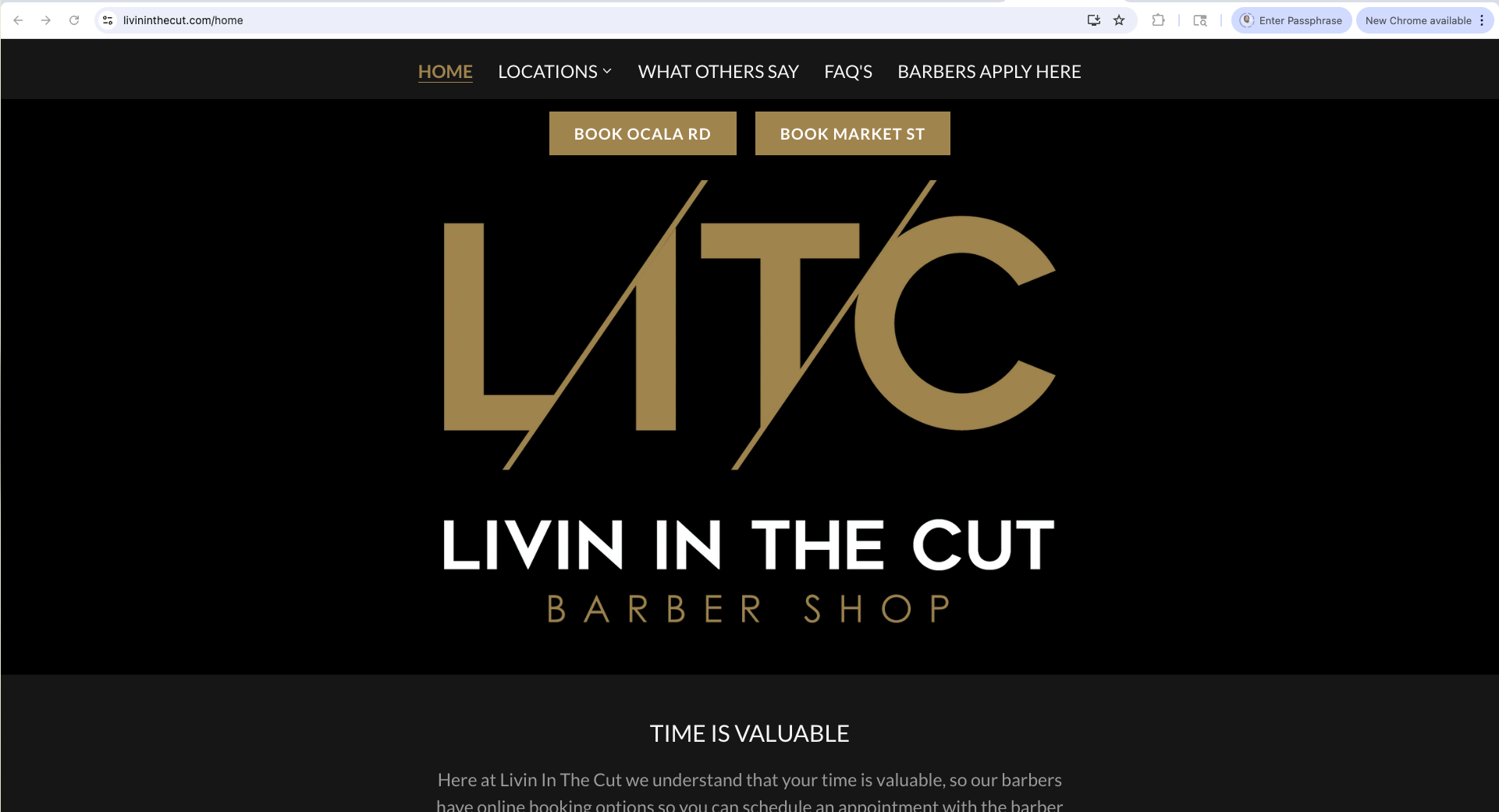
Visual Hierarchy - The homepage prioritized brand identity over user goals. The logo and tagline dominated the hero section while booking CTAs were secondary elements competing for attention. No clear entry point for the primary user task.
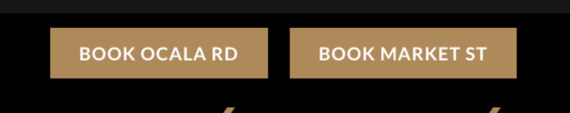
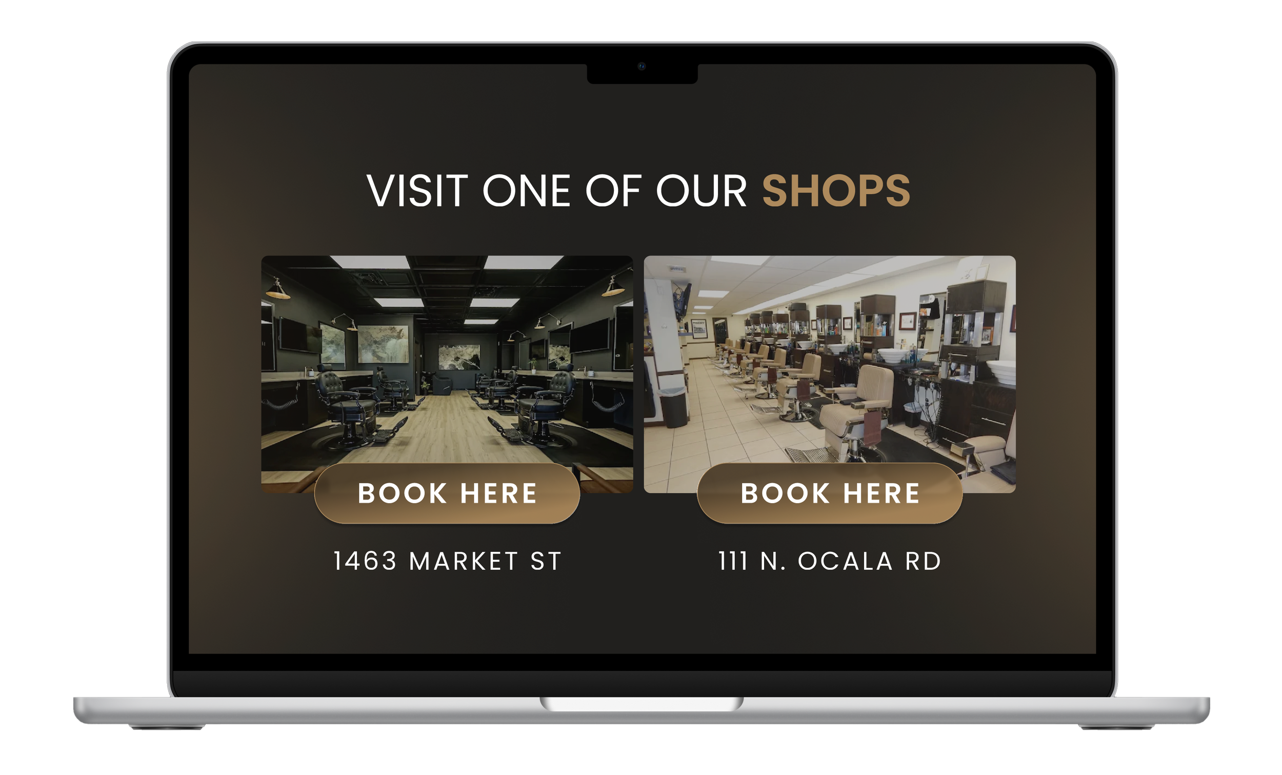
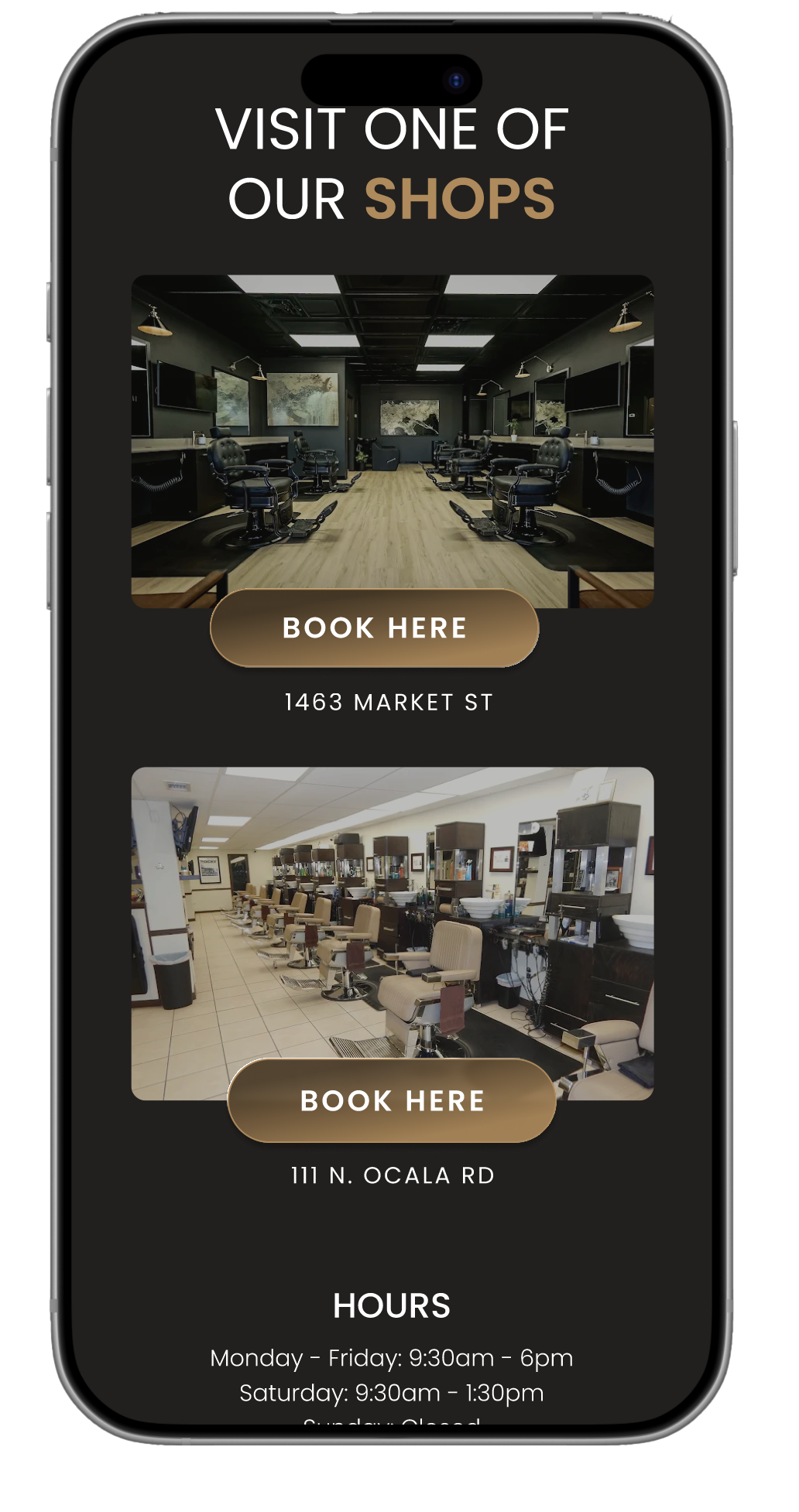
Two-Location Problem - The dual booking buttons appeared as duplicate CTAs rather than distinct location choices. No visual differentiation, no context about neighborhoods or addresses, creating confusion rather than clarity.
Mobile Experience - Navigation was cluttered with secondary pages. The booking flow required multiple taps to understand location/barber differences and service offerings.
Missing Elements - No consolidated services page, no pricing context, minimal photography showcasing the shops or work, and testimonials isolated from the brand story.
The audit confirmed that the site functioned more as a brand brochure than a conversion-focused tool for a service business.
Product Audit
To create an effective barbershop website, I analyzed 8-10 competitor sites in Tallahassee and similar markets, focusing on multi-location presentation, booking flows, and information architecture.
The most successful sites prioritized user goals immediately - prominent booking CTAs, clear location details, and upfront service context. Sites leading with brand messaging over user needs showed higher friction and lower conversion.
This analysis revealed what drives bookings: remove barriers to action while maintaining authentic brand personality. These insights informed a redesign structure that makes booking effortless without sacrificing the character that distinguishes Livin In The Cut.
Market Analysis

User Pain Points
Through analysis of the existing site and understanding typical barbershop customer behavior, I identified key friction points preventing users from booking appointments:
Unclear Location Structure - Users couldn't immediately tell there were two locations or which one to choose. The dual booking CTAs appeared redundant rather than representing distinct shops, forcing users to guess or click through to figure it out.
Buried Primary Action - The site led with brand messaging and imagery instead of the main thing users came to do: book an appointment. This added unnecessary steps between landing on the site and completing their goal.
Fragmented Information - Essential details (services, testimonials, location info) were scattered across multiple pages, requiring excessive clicking and navigation to build a complete picture of the business.

The Challenge
While redesigning a website with two physical locations, there are various considerations to be mindful of to ensure both user and business needs are met.
Users needed clarity on location differences without being overwhelmed by choice. The existing site treated both locations equally, creating confusion rather than helping users make informed decisions. I had to balance providing enough information to differentiate the locations while establishing an intuitive structure that didn't create cognitive overload. The challenge was designing a system where location selection felt natural and obvious, not like a barrier to booking.
Homepage Screenshot
Shows the cluttered layout, competing CTAs, unclear two-location structure. You can annotate this with callouts pointing out specific issues ("Unclear which location to book," "Brand messaging dominates over user needs," "Multiple CTAs compete for attention").
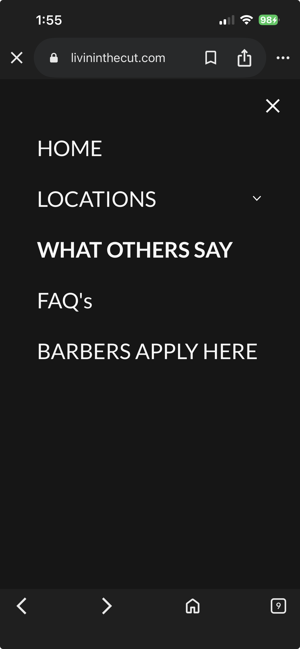
Navigation/Page Structure
Screenshot showing the nav with all those extra pages (What Others Say, FAQs as separate pages). Helps illustrate the fragmented information architecture.
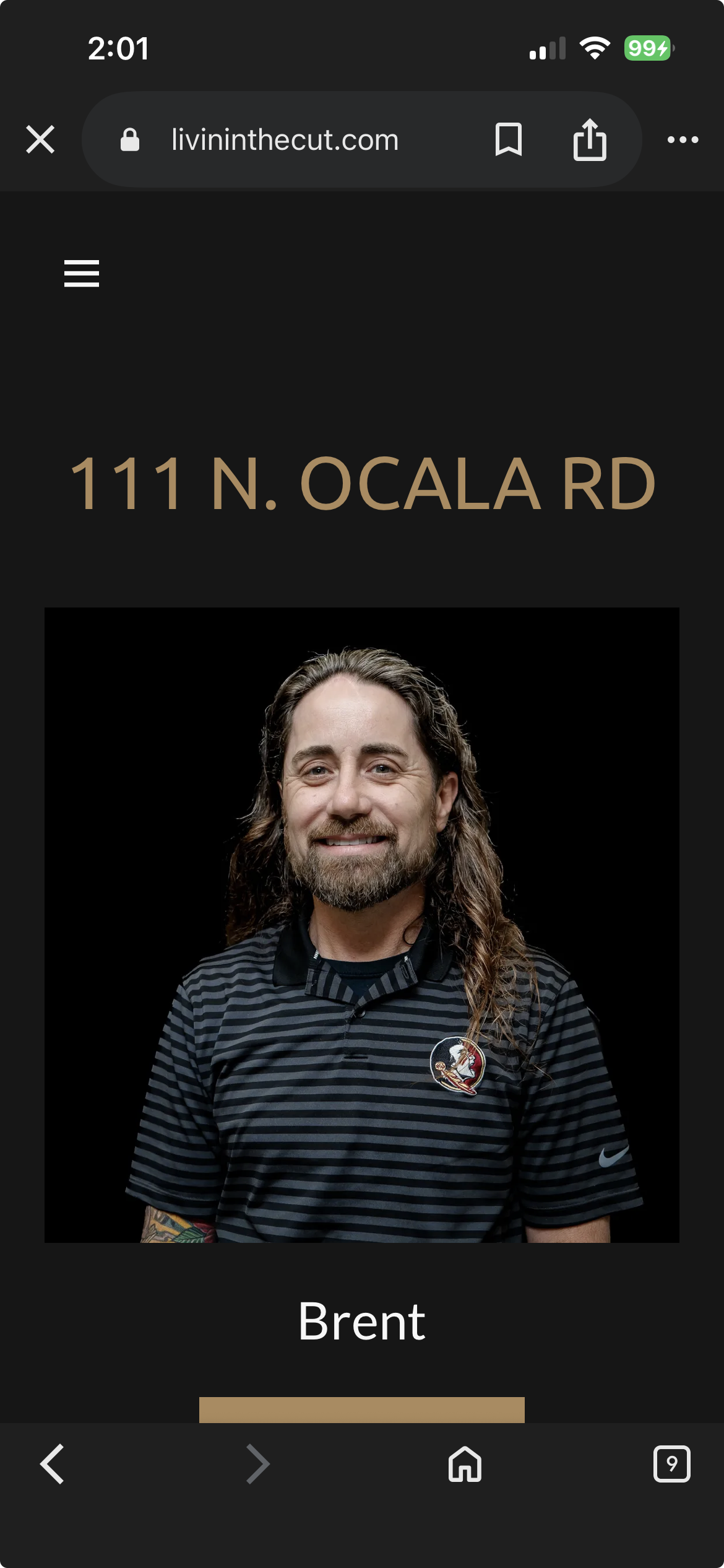
Two-Location Problem CTAs
The dual booking buttons appeared as duplicate CTAs rather than distinct location choices. No visual differentiation, no context about neighborhoods or addresses, creating confusion rather than clarity.
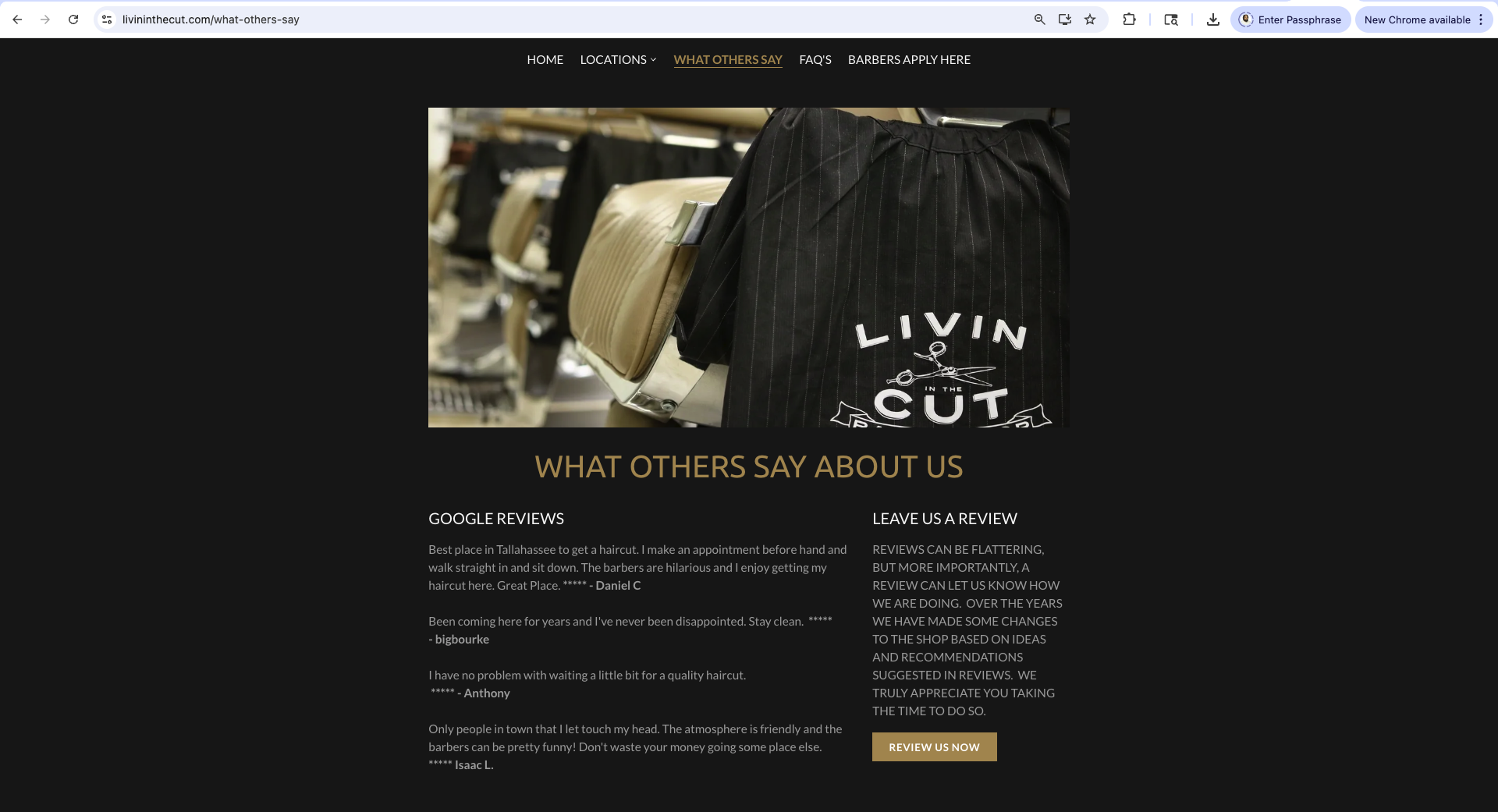
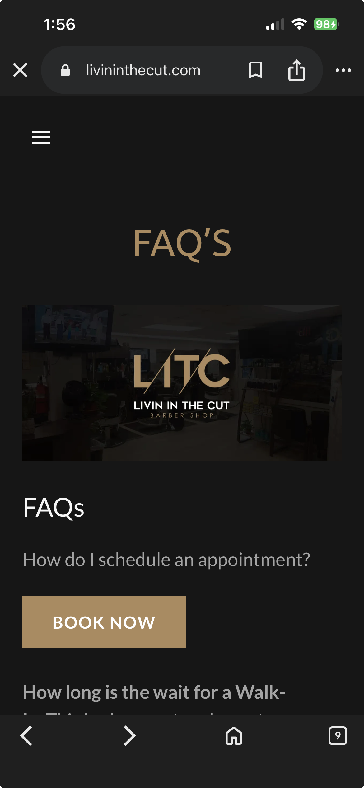
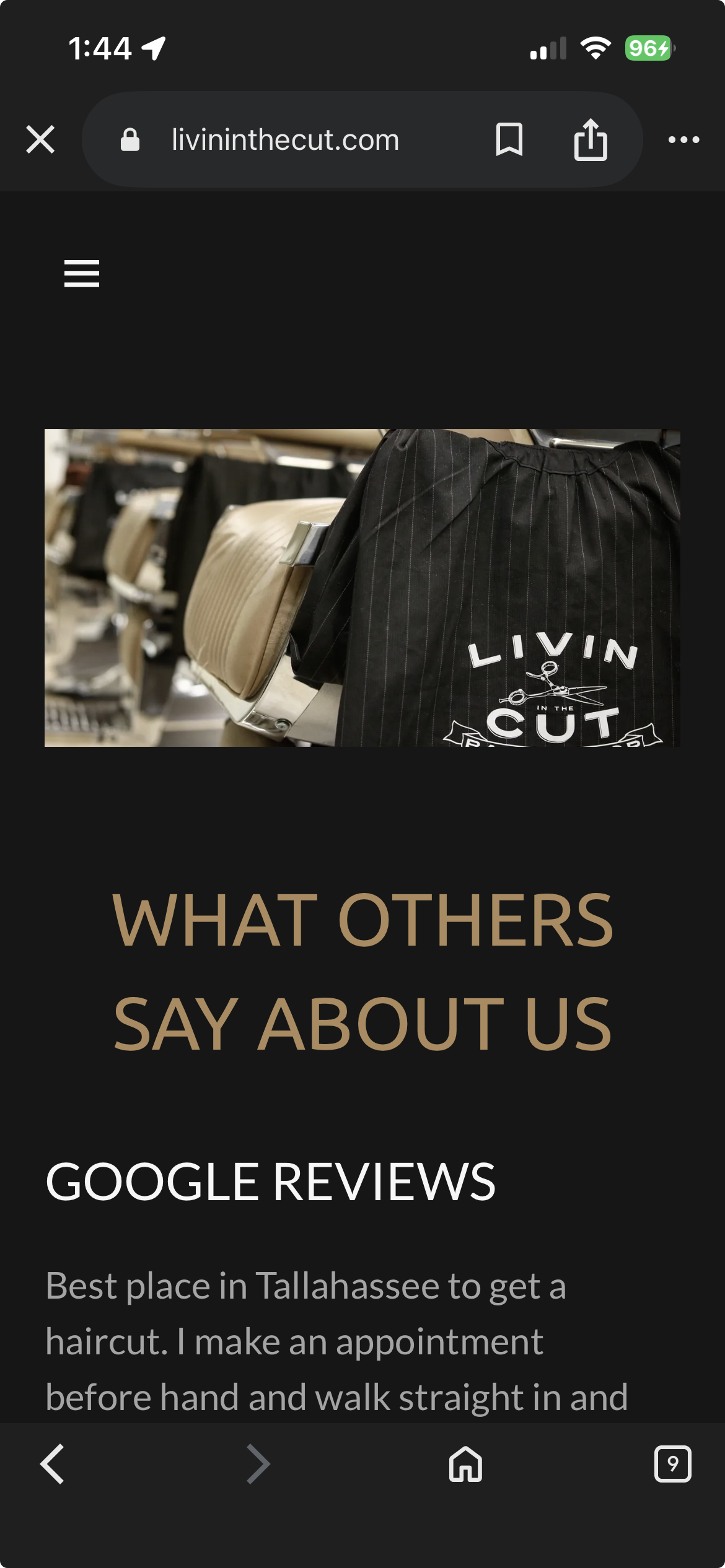
"What Others Say" Page
Shows content that should be integrated elsewhere, demonstrates poor use of a dedicated page.
Mobile Experience
Navigation was cluttered with secondary pages. The booking flow required multiple taps to understand location/barber differences and service offerings.

02
The Planning and Approach
Livin In The Cut had existing content and booking infrastructure, but lacked clarity in presenting two locations. Using competitive analysis and user research, I identified what customers prioritize: location convenience, visual proof of quality, and easy booking.
I developed a location-first system where users see both shops immediately with photography of each interior, the address, and a booking button. The visual differentiation through shop photos helps users distinguish locations while the address provides geographic context. Through iterative design, I created a structure where location selection feels natural, booking CTAs remain prominent, and essential information supports the primary goal: converting visits into appointments.
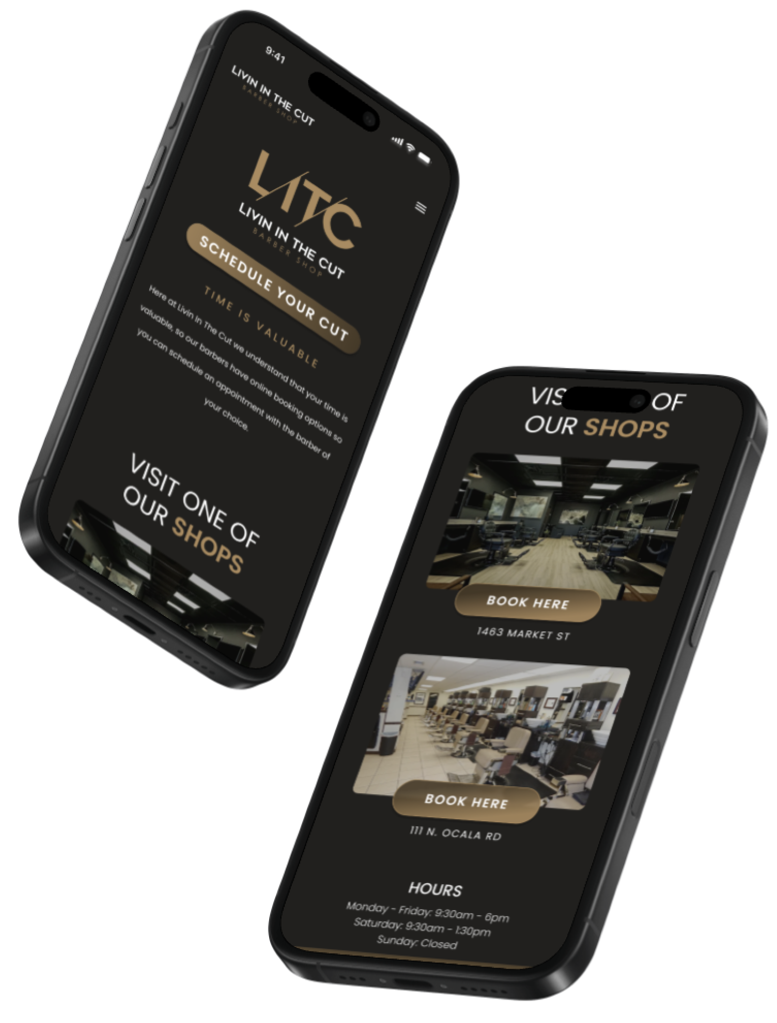
Landing Page Redesign
I redesigned the landing page to prioritize booking while maintaining brand presence. The hero section balances the LITC logo with a prominent "Book Your Cut" CTA - both given equal visual weight without one overpowering the other. The button features a hover highlight effect that confirms interactivity. When clicked, it smoothly scrolls users to the location selection section below, creating a clear path from arrival to booking while preserving the brand's identity.

Interactive Elements
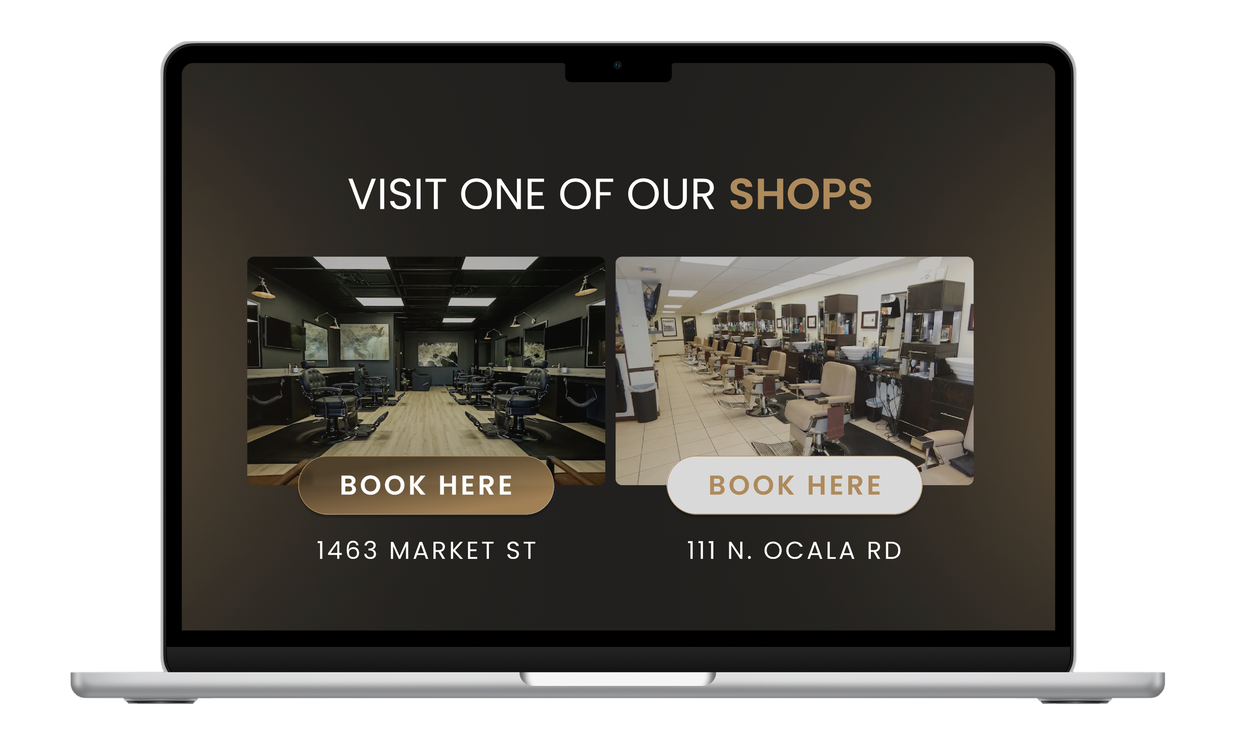
To enhance usability, I created interactive buttons with hover states that highlight on mouseover. This visual feedback confirms clickability and creates a more engaging, responsive experience that guides users confidently through the booking process.
About the Cut / Review / Subscribe Section
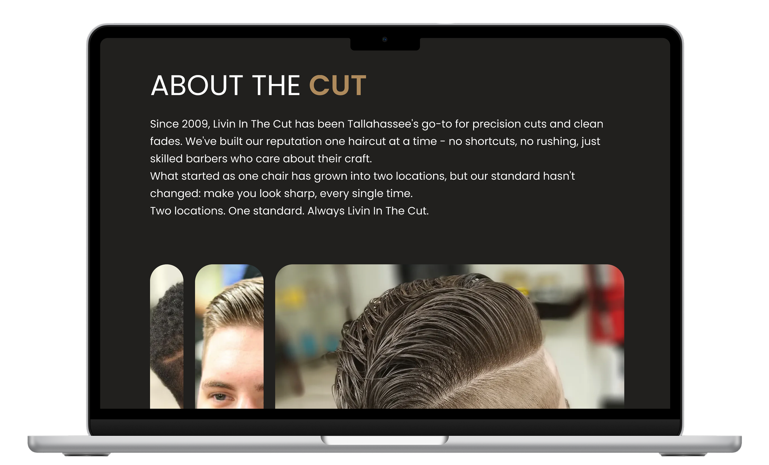
This section consolidates the full Livin In The Cut story into one cohesive experience. It opens with their brand narrative, followed by a parallax photo gallery showcasing their work in an engaging, interactive way that makes browsing feel dynamic rather than static.
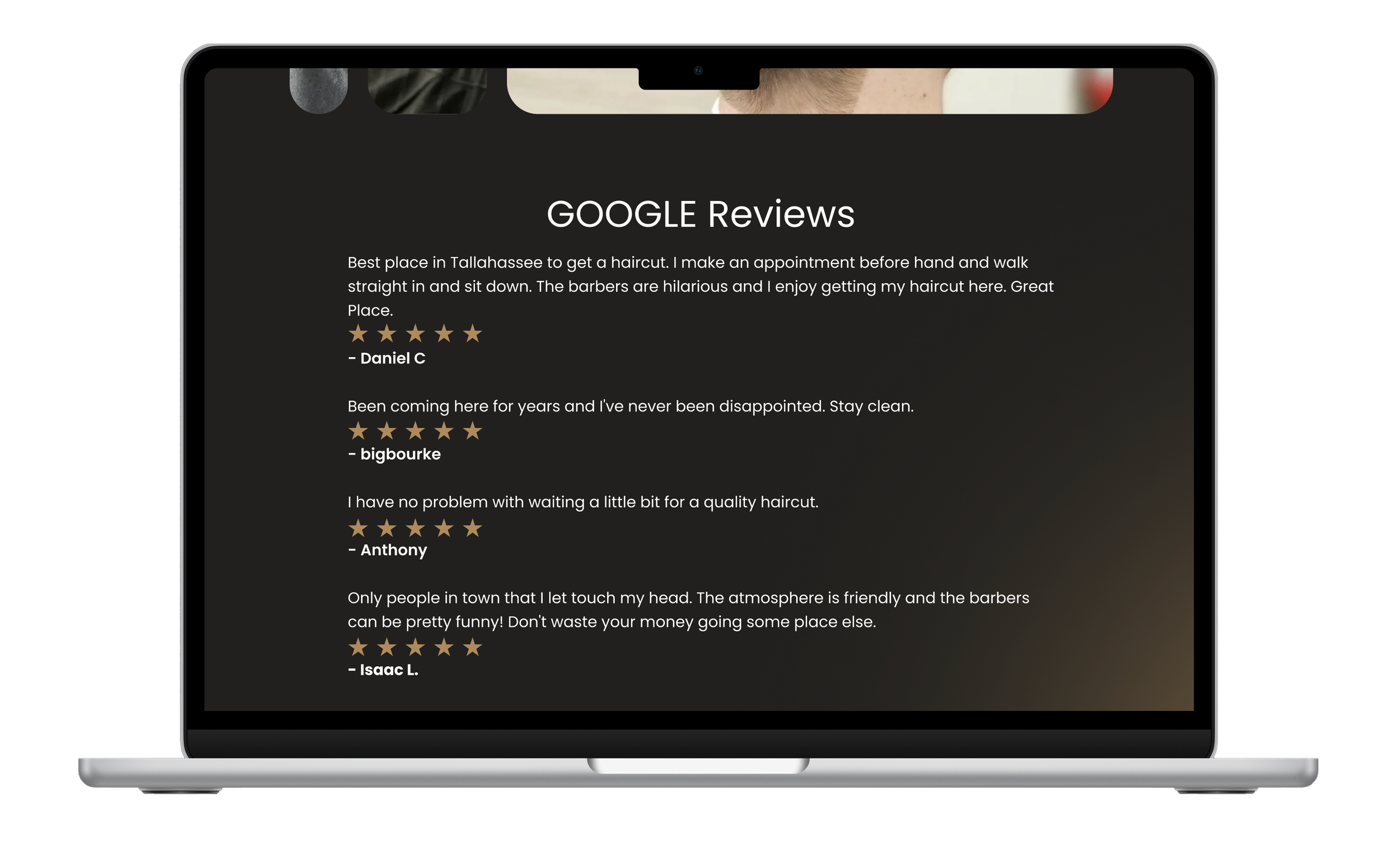
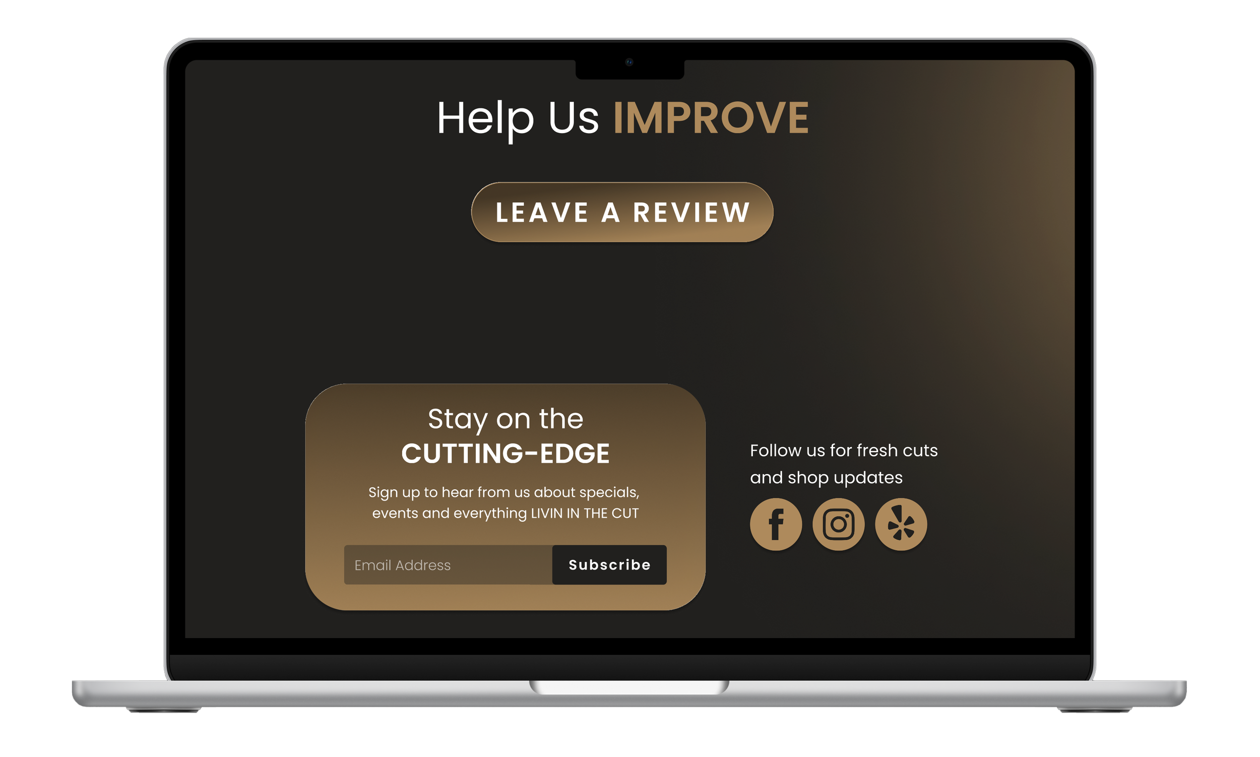
Below the visual story, I integrated Google reviews to provide social proof, paired with a "Leave a Review" button that encourages customer participation. The section closes with a "Stay Connected" card featuring an email subscription field and social media icons, giving users multiple ways to stay updated on shop news and specials.
By combining brand story, visual proof, customer testimonials, and connection points in one place, this section captures the complete personality of Livin In The Cut - who they are, what they deliver, and how customers can stay engaged.
Barber Display Redesign
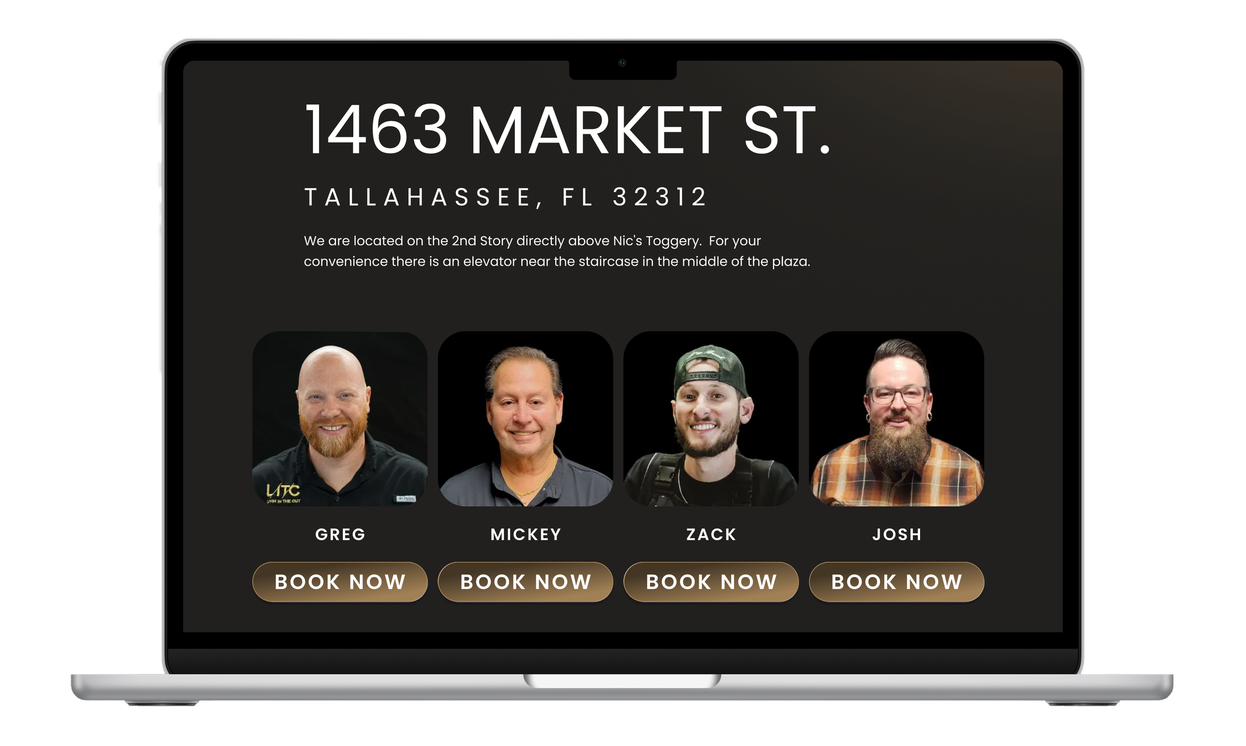
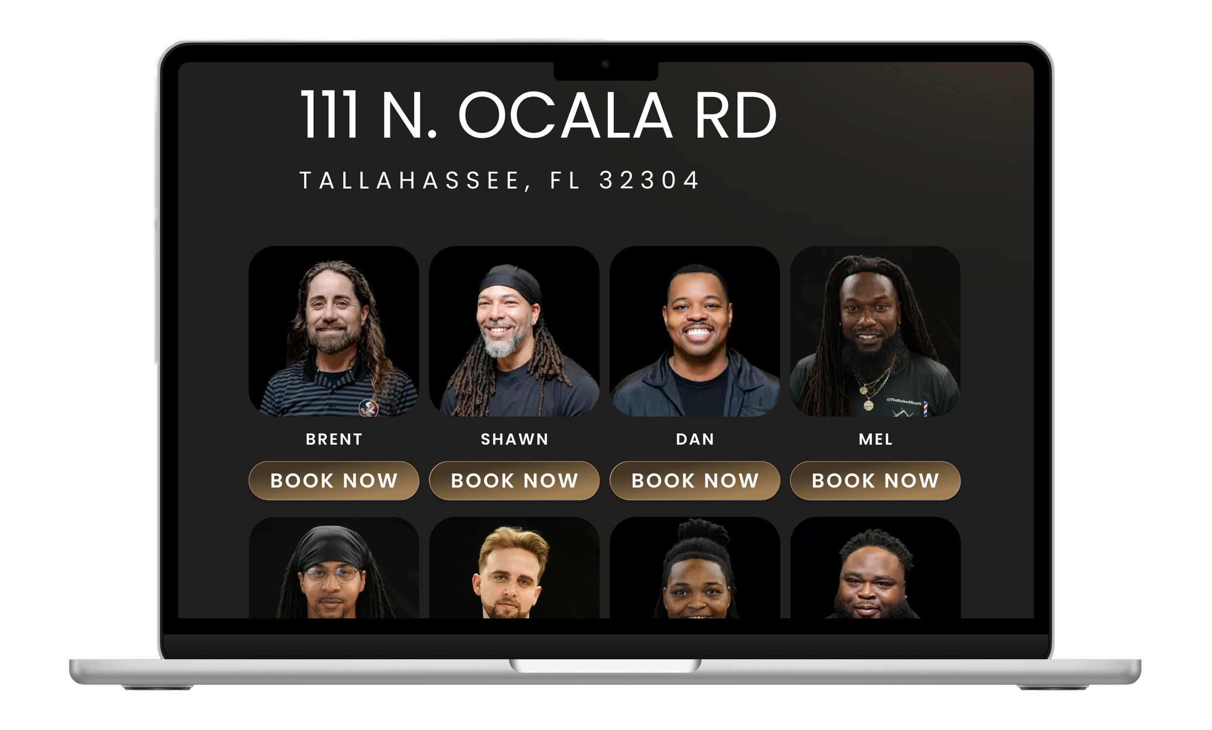
The original layout displayed barbers in a way that cut most of them off below the fold, leading users to believe fewer barbers were available unless they scrolled. I redesigned this section with a cleaner, grid-based layout showing barbers in rows of four. This allows users to see multiple barbers immediately upon landing, providing a complete view of available staff without requiring extensive scrolling.
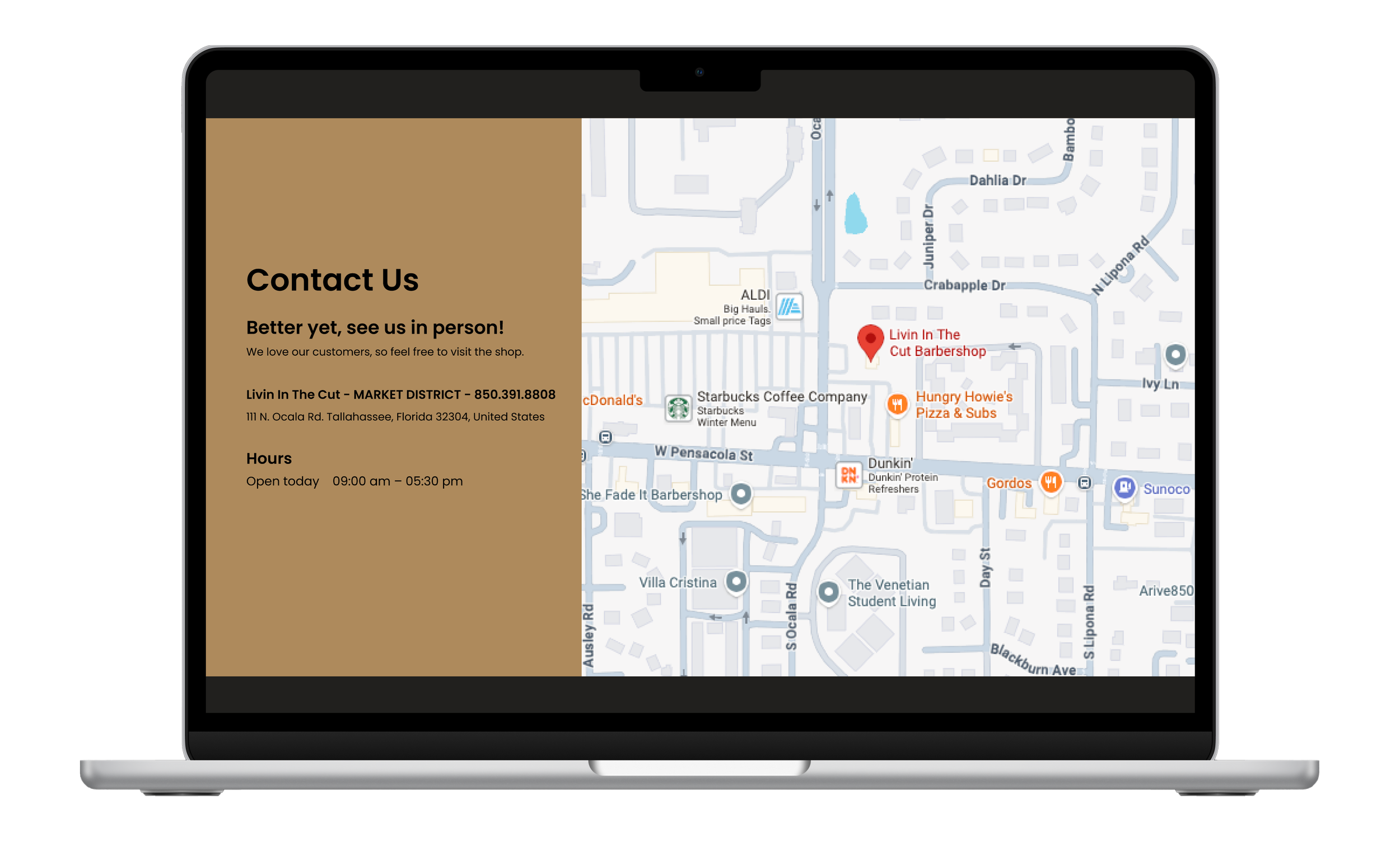
Each barber card includes their name and an interactive booking button, making selection straightforward. Directly below the barber grid, I placed contact information and an embedded map for that specific location, ensuring users have all essential details - staff, contact, and directions - in one consolidated view on each location page.
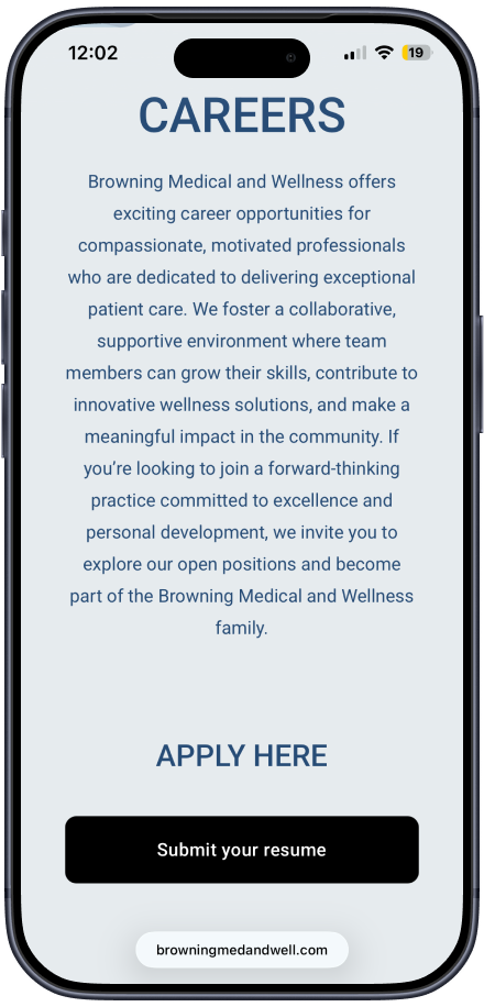
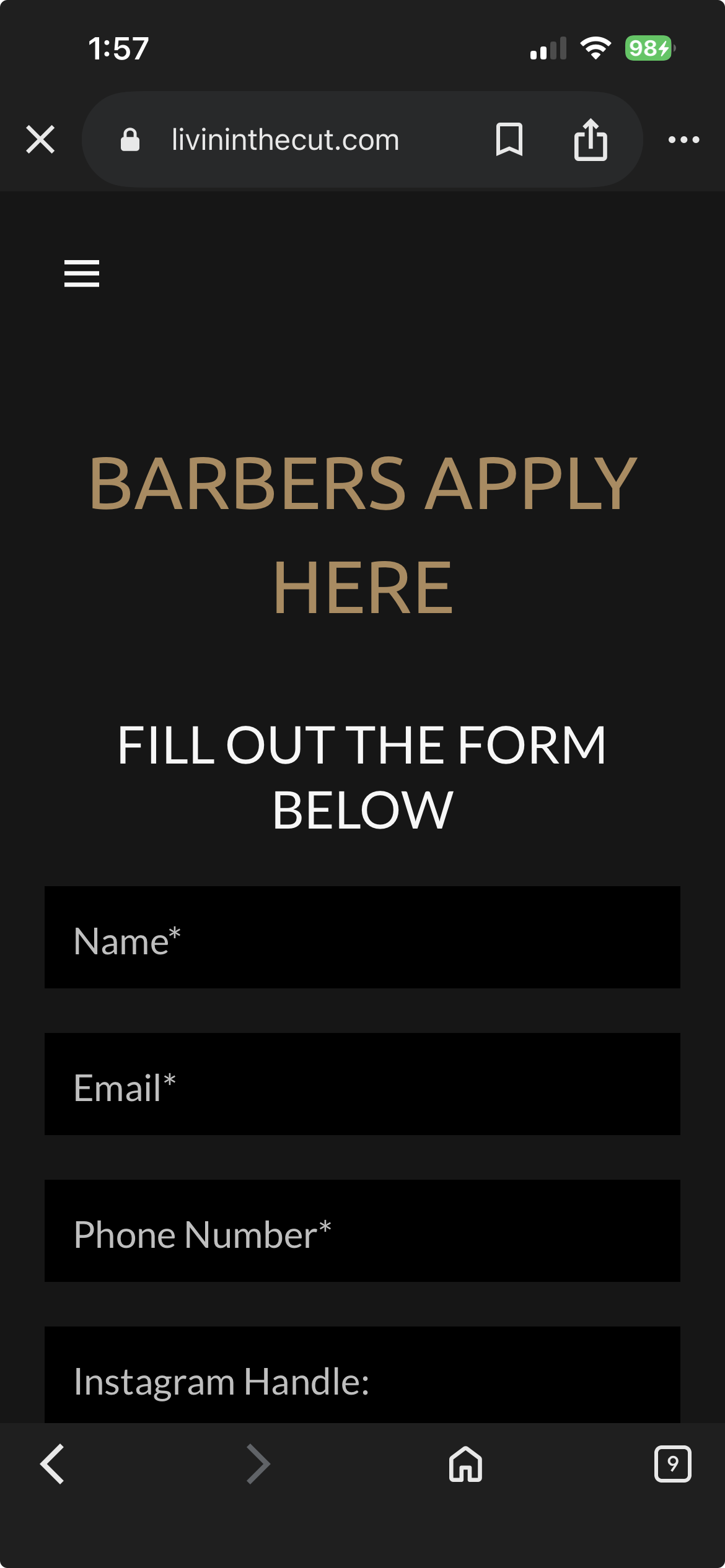
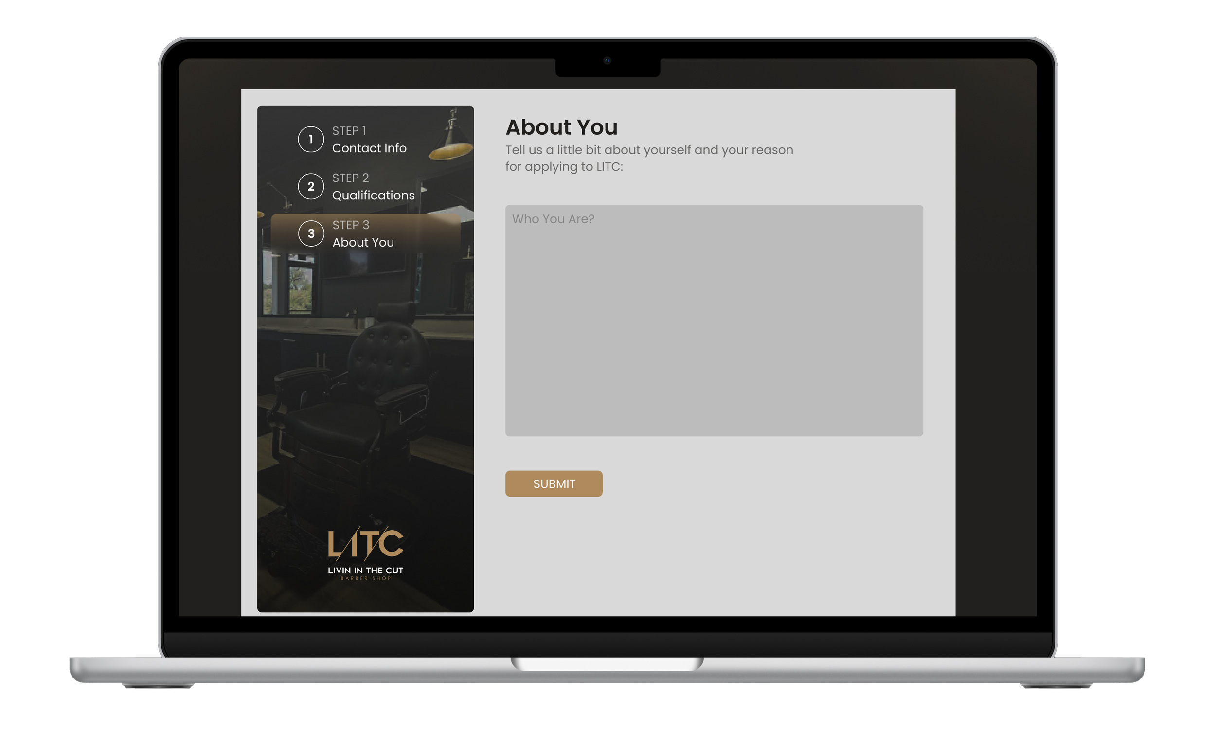
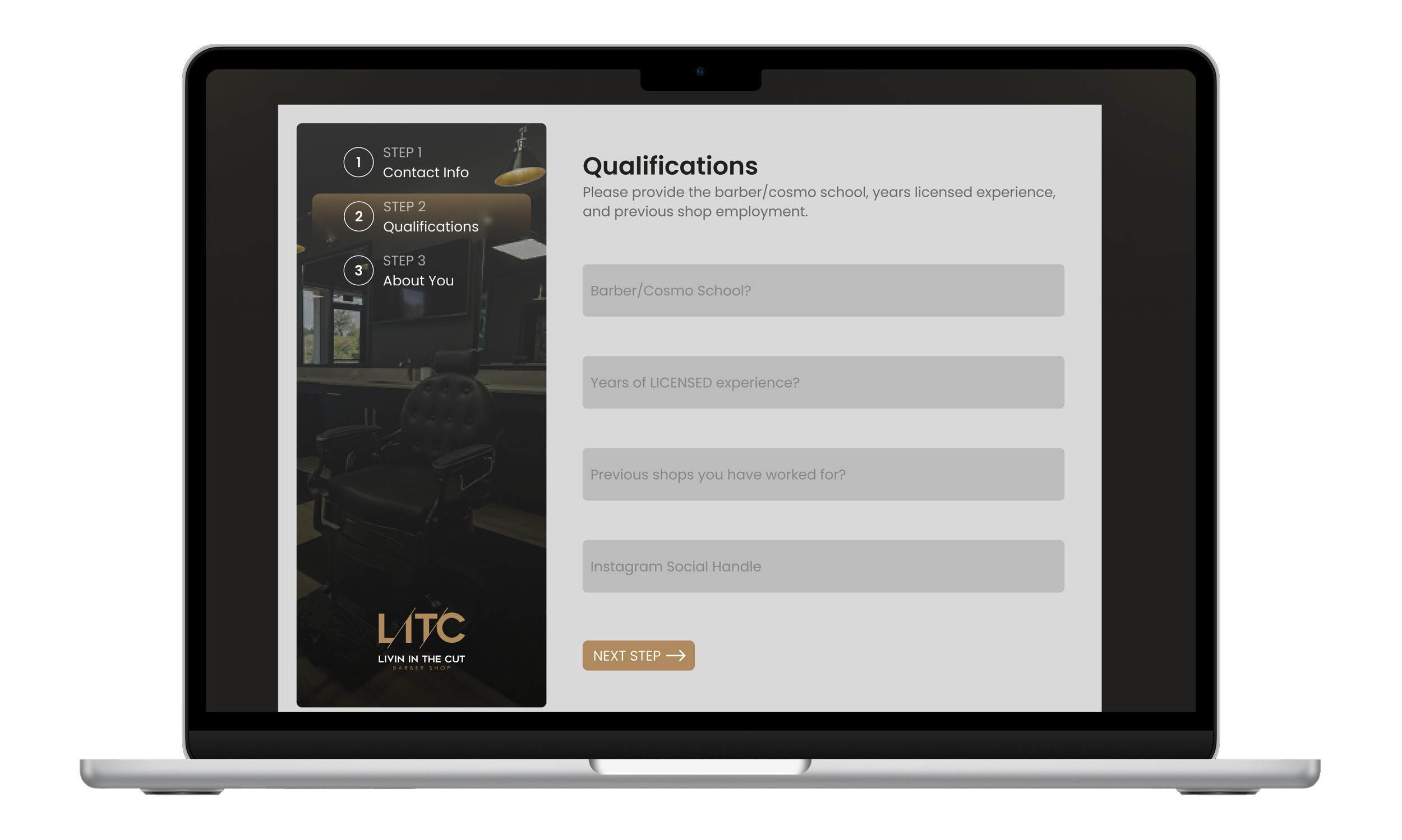
Careers Page Redesign
The original careers page consisted of a single, lengthy form that extended well beyond the screen, forcing users to scroll extensively just to understand what information was required. This created friction and likely increased form abandonment.
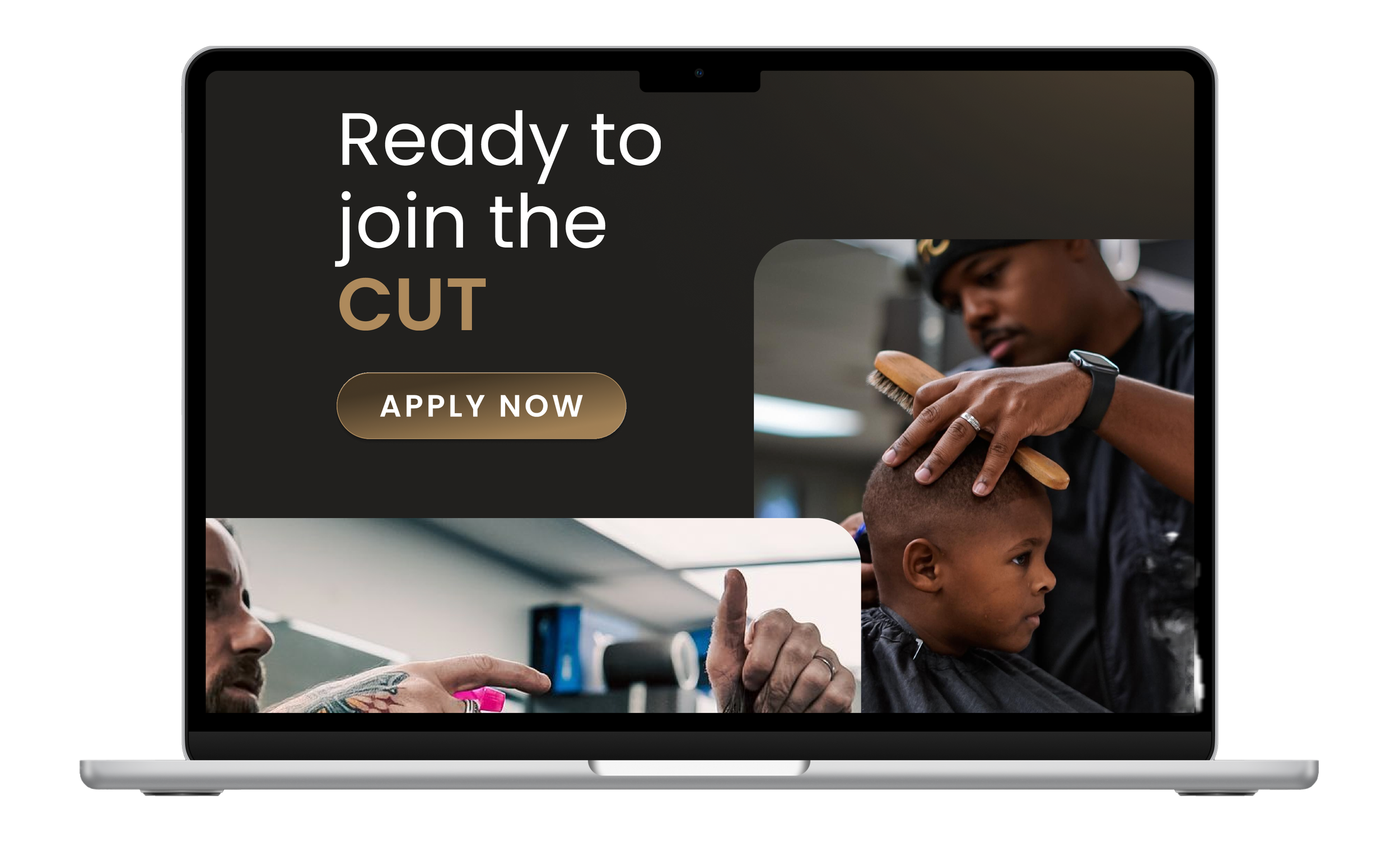
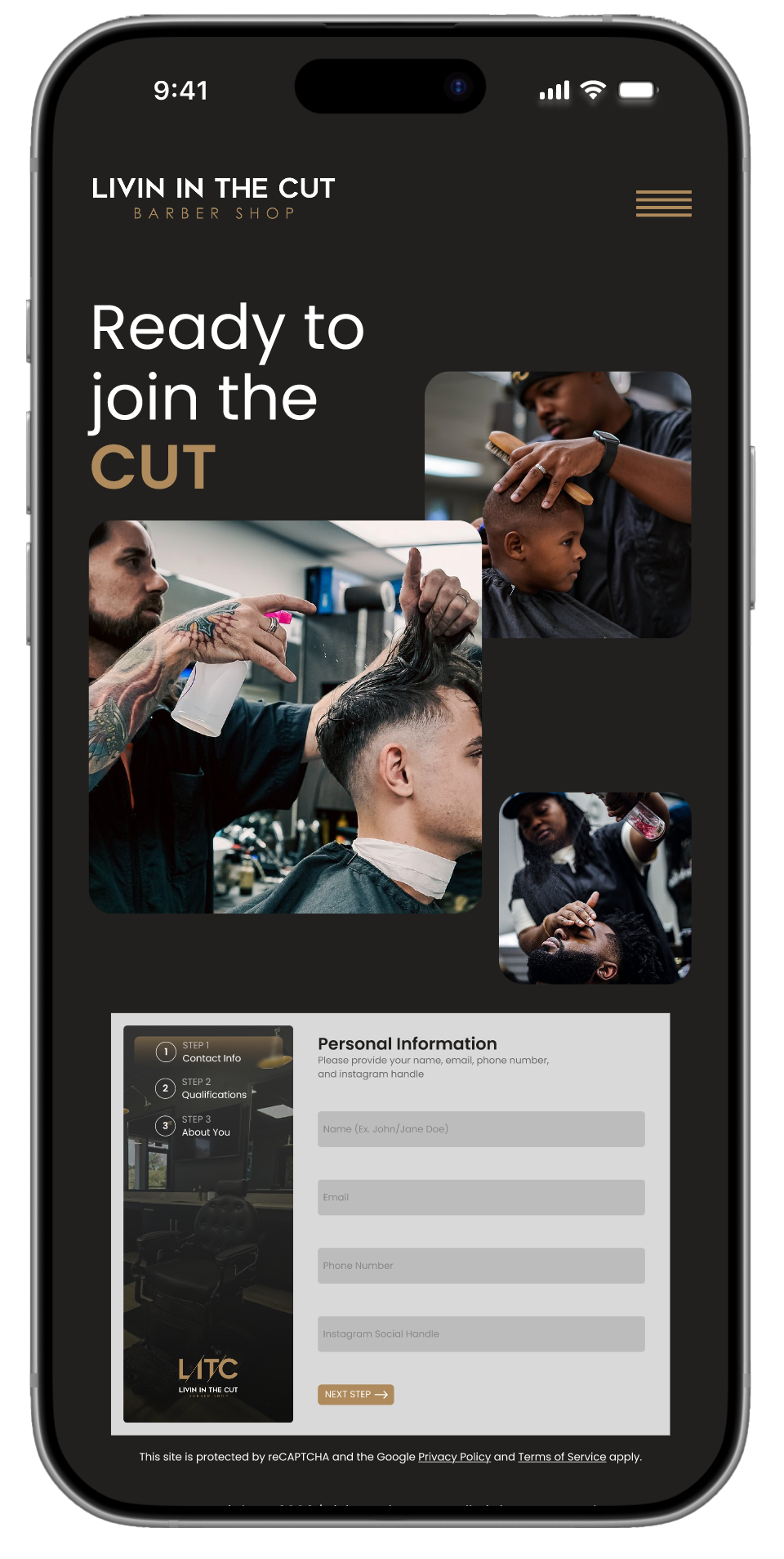
I redesigned the page to be more intuitive and engaging. The landing section features a hero CTA with an "Apply Now" button, accompanied by photos of actual barbers working with customers. This visual context immediately confirms what page users are on while showcasing the work environment.
When clicked, the button scrolls to a simplified multi-step form that breaks the application into manageable sections. This step-by-step approach shows users exactly what's required at each stage, reducing cognitive load and making the process feel less overwhelming. The experience concludes with a confirmation message thanking applicants for their submission, providing clear feedback that their application was received.
The redesign transformed Livin In The Cut's website from a brand-centric brochure into a conversion-focused tool. Users now land on a page that immediately balances brand identity with clear action - the hero section features equal prominence of the logo and "Book Your Cut" CTA, which scrolls directly to location selection.
The two-location challenge was solved through visual differentiation: side-by-side cards featuring interior shop photography, addresses, and booking buttons make the choice obvious and informed. Essential information - barber availability, contact details, maps - is now consolidated on each location page in scannable grids rather than hidden or fragmented.
Content architecture was streamlined significantly. The "About the Cut" section now combines brand story, parallax photo gallery, customer reviews, and connection points (email signup, social media) in one cohesive experience. The careers page evolved from an overwhelming single form into a guided multi-step application with visual context and clear progress indicators.
The result is a website that removes friction at every decision point - from choosing a location to booking a barber to applying for a position - while maintaining the authentic personality that distinguishes Livin In The Cut in the Tallahassee market.